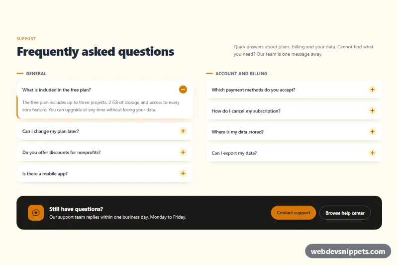
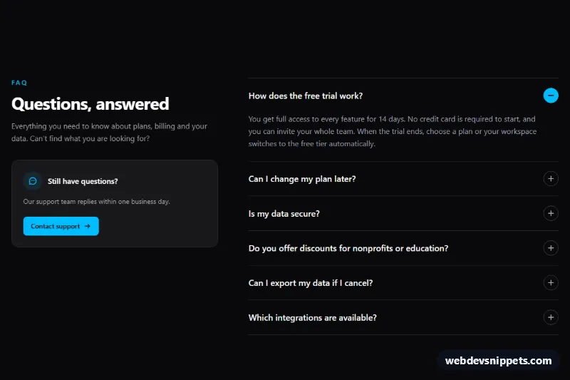
A Bootstrap 5 FAQ section that splits questions into two side-by-side accordion columns and ends with a dark contact prompt card. Use it on pricing pages, product landing pages and help pages where visitors need quick answers before they reach out.
How it works
The root is section.fq-faq. A header row places the .fq-kicker, the #fq-title heading and the .fq-intro text side by side on large screens. Below it, two col-lg-6 columns each hold a .fq-group label and an independent Bootstrap accordion (#fq-acc-1 and #fq-acc-2). Every collapse panel uses data-bs-parent pointing to its own column, so opening a question closes the others in the same column only. Under the lg breakpoint the columns stack into a single list.
The look comes from overriding Bootstrap's accordion custom properties inside .fq-accordion: borders are removed, items become separate rounded cards with a gap, and the chevron is replaced by an amber plus icon that switches to a minus when open (--bs-accordion-btn-icon and --bs-accordion-btn-active-icon). An open item gets an amber left bar through :has(.accordion-button:not(.collapsed)). The aside.fq-contact card closes the section with an icon, a short message and two buttons.
No custom JavaScript is needed; the Bootstrap bundle handles the collapse behavior.
Customization
--fq-accentand--fq-accent-softin.fq-faq: change the kicker, group bar, open-item bar and contact buttons. Update the hex colors inside the two icon data URIs to match.--fq-bgand--fq-darkin.fq-faq: set the section background and the contact card color.--fq-item-radiusin.fq-faq: make the question cards rounder or square.data-bs-parenton each.accordion-collapse: remove it to let several answers stay open at once.- Add
showto an.accordion-collapse, removecollapsedfrom its button and setaria-expanded="true"to open a different question on load. col-lg-6on both columns: change tocol-xl-6to keep a single column until wider screens.- The
hrefvalues on.fq-btn--primaryand.fq-btn--ghost: point them to your contact form and help center.
Accessibility
Each question is a real button inside a heading, with aria-expanded and aria-controls kept in sync by Bootstrap, and each answer panel is labelled by its question. Headings follow a clear order: the section title, the column groups, then the questions. Buttons show an amber focus ring, and the contact links use a light focus-visible outline on the dark card. The contact card is an aside labelled by its own heading. Bootstrap disables the collapse animation for users who prefer reduced motion, and the shadow transition is turned off as well.
Usage notes
Requires Bootstrap 5 and Bootstrap Icons. The :has() highlight works in all current browsers; older browsers simply skip the left bar. Keep ids unique if you reuse the section on one page.