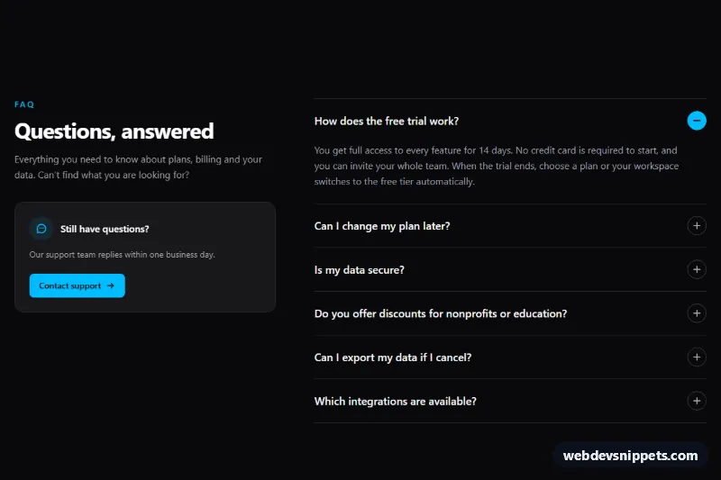
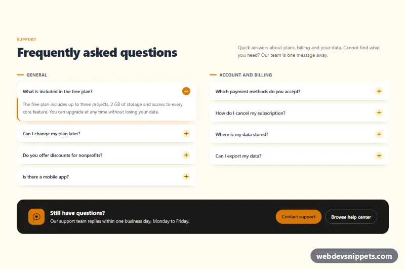
A dark FAQ section built with Tailwind CSS and a small vanilla JavaScript controller: an intro column with a "Still have questions?" support card on the left and an accordion of expandable answers on the right. Answers slide open smoothly, only one stays open at a time, and the pattern follows the WAI-ARIA accordion guidance, which makes it a solid fit for pricing pages, help centers and product landing pages.
How it works
The root is section.tfa-faq on a bg-zinc-950 background. From the lg breakpoint a two-column grid places the intro column (sticky while you scroll) next to .tfa-list; on phones the columns stack.
Each question is a .tfa-item containing an h3 with a button.tfa-trigger and a .tfa-panel answer region. The button has aria-expanded and aria-controls, and the panel has role="region" with aria-labelledby pointing back to the button. The round .tfa-icon shows a plus sign; its .tfa-bar stroke rotates 90 degrees to form a minus, and group-data-[open]: classes fill the circle with sky blue on the open item.
On DOMContentLoaded the script initializes every .tfa-faq, syncs the data-open attribute on each item with its aria-expanded value and then sets data-tfa-ready on the root. Only then does style.css collapse the panels, animating grid-template-rows from 0fr to 1fr so answers of any length open smoothly without measuring heights. Closed panels also get visibility: hidden, which keeps their content out of the tab order and the accessibility tree. Clicking a question toggles it; because the root has data-tfa-single, opening one closes the others. Without JavaScript every answer is shown and the icons are hidden.
Customization
- Remove
data-tfa-singlefrom.tfa-faqto let several answers stay open at once. - Set
aria-expanded="true"on a different.tfa-trigger(anddata-openon its.tfa-item) to open another question by default, or set all tofalse. 0.3sin thegrid-template-rowstransitions instyle.css: speed up or slow down the open animation.text-sky-400,bg-sky-400andgroup-data-[open]:bg-sky-400: replaceskywithvioletoramberfor a new accent.lg:grid-cols-[minmax(0,2fr)_minmax(0,3fr)]on the inner grid: remove it and the intro column for a single centered accordion.- Duplicate a
.tfa-itemto add questions, giving its button and panel newidvalues such astfa-q7andtfa-a7.
Accessibility
Questions are real buttons inside headings, so they work with Enter and Space and appear in heading navigation. aria-expanded announces the state, and each answer region is labelled by its question. Arrow Up and Arrow Down move focus between questions, while Home and End jump to the first and last. Focus rings use focus-visible:outline-sky-400. Decorative icons are aria-hidden. Under prefers-reduced-motion: reduce all transitions are removed and panels open instantly. Zinc and sky text on zinc-950 meets WCAG AA contrast.
Usage notes
Several FAQ blocks can share a page; give each copy unique id values for headings, buttons and panels.