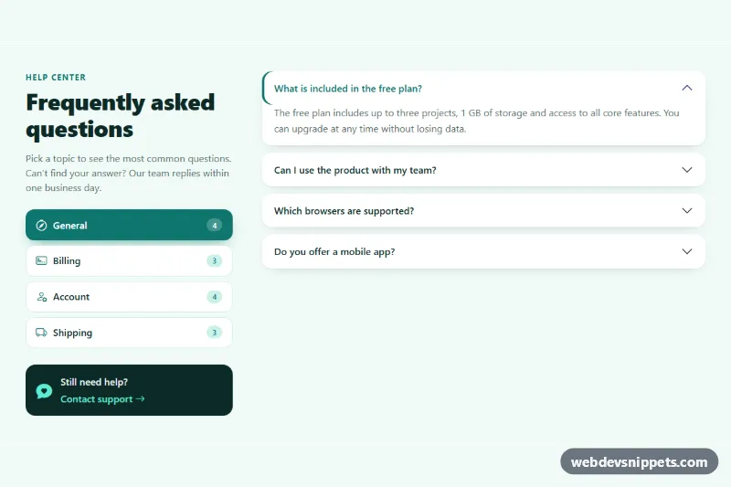
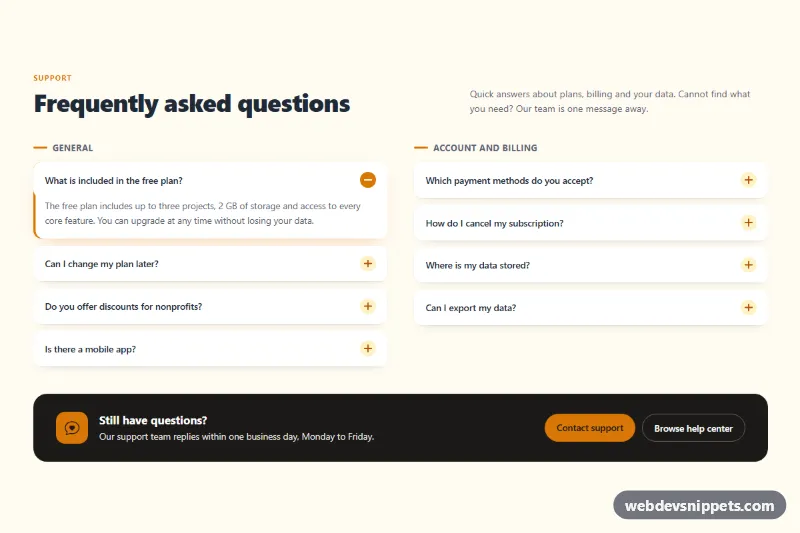
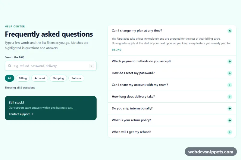
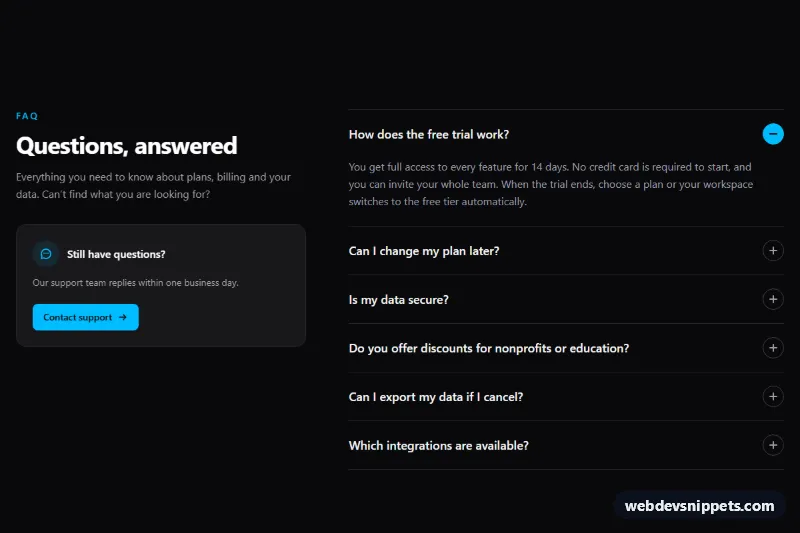
A Bootstrap 5 FAQ section that groups questions by topic: category pills on the left switch between separate accordion sets on the right. It suits help centers, pricing pages and product landing pages where one long list of questions would be hard to scan. It needs no custom JavaScript, because Bootstrap's tab and collapse plugins do all the work.
How it works
The root section.fqt-faq uses a Bootstrap grid. The left column (col-lg-4) holds the heading, an intro line, the .fqt-pills tab list and a dark .fqt-contact card. Each .fqt-pill is a nav-link button with data-bs-toggle="pill" and a data-bs-target that points to a .tab-pane. Pills show an icon, the label and a .fqt-pill-count badge with the number of questions.
The right column contains .tab-content.fqt-content with one tab-pane per category (#fqt-pane-general, #fqt-pane-billing, #fqt-pane-account, #fqt-pane-shipping). Every pane wraps its own .accordion.fqt-accordion, and each .fqt-item uses data-bs-parent with that pane's accordion id, so only one answer per category is open at a time. The first question of every category starts expanded.
On phones the pills sit in a horizontally scrollable row; from the lg breakpoint flex-lg-column stacks them vertically as a sidebar and the support card appears. The accordion is restyled through Bootstrap's own --bs-accordion-* variables into separate rounded cards with an accent bar on the open question.
Customization
--fqt-accentand--fqt-accent-softon.fqt-faqinstyle.css: change the teal used by the active pill, count badges and open question.--fqt-bgand--fqt-card: set the section background and the card color of pills and questions.--fqt-radius: make the question cards and the support card more or less rounded.col-lg-4andcol-lg-8: change the column split, for examplecol-lg-3andcol-lg-9for a narrower sidebar.- Remove
data-bs-parentfrom the.accordion-collapseelements of a pane to let several answers stay open at once. - Add a category by copying one
.fqt-pilland one.tab-pane, then giving both new matching ids.
Accessibility
The pill container has role="tablist" with an aria-label; each pill has role="tab", aria-controls and aria-selected, and each pane has role="tabpanel" with aria-labelledby. Bootstrap moves focus between tabs with the arrow keys and keeps only the active tab in the tab order. Accordion buttons expose aria-expanded and aria-controls. Questions use h3 headings under the section h2, focus rings use a high-contrast amber :focus-visible outline, and transitions are turned off with prefers-reduced-motion.
Usage notes
Requires the Bootstrap 5.3 bundle and Bootstrap Icons. Ids must be unique, so prefix them differently when you place two FAQ sections on the same page.