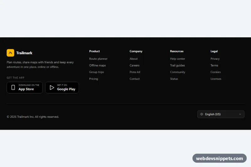
A dark website footer built with Tailwind CSS: brand block with a short pitch, App Store and Google Play download badges, four link columns and a bottom bar with the copyright line and a language select. It suits apps, SaaS products and any site that promotes a mobile app.
How it works
The root is footer.tfd-footer on a bg-neutral-950 background, labelled by a screen-reader-only h2#tfd-heading. The top area is a 12-column grid at the lg breakpoint: the brand column (lg:col-span-4) holds the logo link, a description and the "Get the app" list, and the remaining eight columns contain a nested grid of four nav elements (Product, Company, Resources, Legal). That nested grid is two columns on phones and four from sm up.
The app badges are plain links styled as black pills with an inline SVG icon and two lines of text ("Download on the / App Store", "Get it on / Google Play"). They are built with utilities only, so they stay sharp and inherit the hover color hover:border-amber-400.
The bottom bar is separated by border-t border-white/10. The language picker is a native select with appearance-none, a globe icon on the left and a chevron on the right, both absolutely positioned and pointer-events-none.
The script runs on DOMContentLoaded for each .tfd-footer. It writes the current year into [data-tfd-year], restores a saved choice into [data-tfd-lang], and on change saves the value and writes "Language set to …" into [data-tfd-status]. Storage calls are wrapped in try/catch, so the footer still works where localStorage is blocked.
Customization
bg-neutral-950on.tfd-footer: change tobg-slate-950orbg-zinc-900for a different shade of dark.- Accent
amber-400(logo tile,hover:text-amber-400, focus outlines, status text): replace it with another Tailwind color such asemerald-400across the markup. - The
optionlist in#tfd-lang: add or remove languages; thevalueis what gets saved underSTORAGE_KEY. - The
changelistener inscript.js: replace the comment with a redirect to your localized URL, for example'/' + select.value + '/'. sm:grid-cols-4on the link columns grid: usesm:grid-cols-3and drop onenavfor a lighter footer.- The badge links: swap the
href="#"values for your store URLs, or replace them with the official store badge images if your brand guidelines require them.
Accessibility
Each link column is a nav labelled by its own heading through aria-labelledby, so screen reader users can jump between groups. Badge and column icons are aria-hidden, and the badge text forms a full accessible name. The select has a real label (visually hidden), and the status paragraph uses role="status" with aria-live="polite". All interactive elements show an amber focus-visible outline, and neutral-400 text on neutral-950 keeps comfortable contrast. Color transitions are turned off with motion-reduce:transition-none.
Usage notes
No style.css is needed. If you place two footers on one page, change the tfd-lang and column heading id values in the second copy.