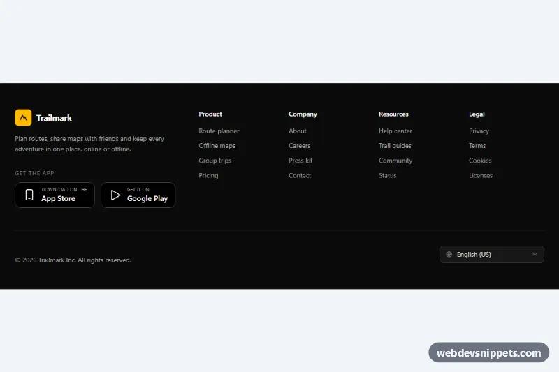
Dark Footer with App Badges
Dark Tailwind CSS footer with four link columns, App Store and Google Play badges, and a language select that remembers the choice.
Site footers with links, social icons and legal info.
4 component(s)
Dark Tailwind CSS footer with four link columns, App Store and Google Play badges, and a language select that remembers the choice.
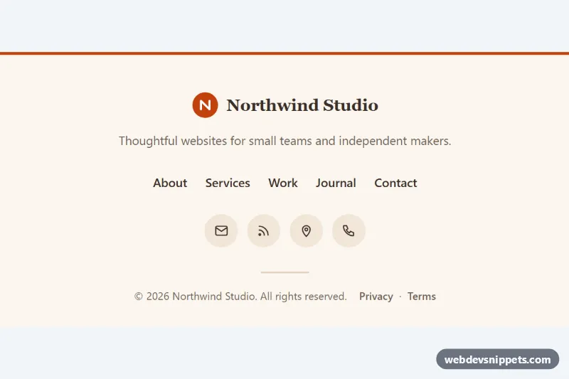
Minimal centered footer in pure CSS with a logo, tagline, links with animated underlines, round icon links and an auto-updating copyright year.
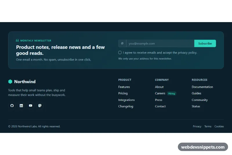
Dark Bootstrap 5 footer with a newsletter signup panel, email validation, social icons, three link columns and a legal bar.
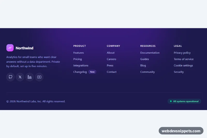
Dark Tailwind CSS website footer with brand block, social icons, four labelled link columns and a bottom bar with copyright and status.
A footer is the section at the bottom of every page. It typically holds secondary navigation, contact details, social media links, a newsletter signup, language or region selectors and legal information such as copyright, privacy policy and imprint links. Footers range from a single line with a copyright notice to multi-column layouts with grouped links, used on marketing sites, online stores, SaaS products and blogs.
Almost every site needs one. Use it for links that people look for but that do not belong in the main navigation, and keep it consistent across all pages.
<footer> element at page level; it becomes a landmark that screen reader users can jump to.<nav> with an aria-label, or use plain lists if they are not navigation.aria-label="Instagram".Footer examples are available in Bootstrap 6, Bootstrap 5, Tailwind CSS and pure CSS. Bootstrap versions use the grid, nav and list utilities, and Bootstrap 6 variants use the theme-* colour roles so light and dark footers follow your theme. Tailwind CSS versions are built entirely with utilities, and pure CSS versions use CSS Grid or Flexbox with custom properties. Filter by framework, check each footer in the live preview, then copy the HTML and CSS from the code tabs or download it. Replace the links, logo and legal text and the responsive footer is ready for your site.