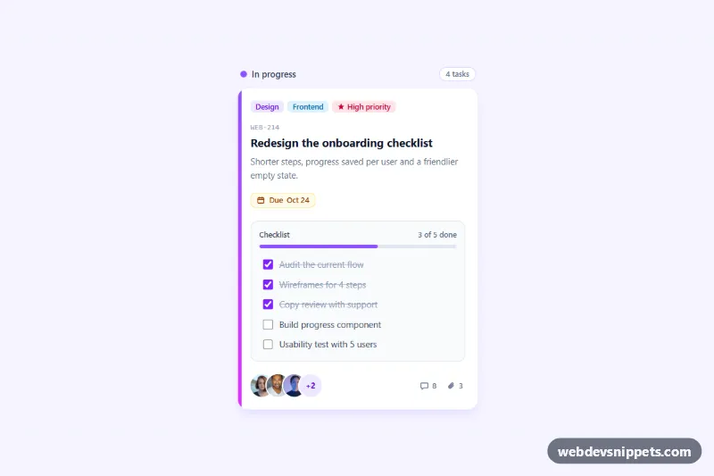
A detailed Kanban task card built with Tailwind CSS and a few lines of vanilla JavaScript. It shows colored labels, a ticket ID, a due date chip, an interactive checklist with a progress bar, overlapping assignee photos and comment and attachment counts. Drop it into a project board, a sprint view or a task detail sidebar.
How it works
The wrapper .tkc-wrap centers a column header ("In progress") and the card itself, article.tkc-card. A thin violet-to-fuchsia gradient strip on the left edge marks the column color. Labels are a ul of small pills, followed by the ticket ID, the title, a short summary and an amber due date with a time element. The script fills that date from data-tkc-due-in (days from today) and sets its datetime; without JavaScript it reads "next week".
The checklist is a fieldset.tkc-checklist. Each checkbox carries data-tkc-item, and the labels use has-[:checked]:line-through so finished steps are struck through with pure CSS. On DOMContentLoaded the script finds every .tkc-card, listens for change events on its checkboxes and recalculates the result: the data-tkc-count text ("3 of 5 done"), the width of the data-tkc-fill bar and aria-valuenow on the data-tkc-bar progressbar. When every item is ticked the bar and counter turn green and the card gets the .tkc-card--done class, which draws a green outline in style.css.
The footer holds the .tkc-avatars stack, built with -space-x-2.5 and white rings, a "+2" counter for hidden assignees, and icons for comments and attachments. style.css adds the progress transition and small hover lifts for the card and avatars.
The assignee photos come from Unsplash; replace them with your team's own profile pictures.
Customization
- Add or remove
data-tkc-itemcheckboxes; the counter and progress bar recalculate automatically. .tkc-card--doneinstyle.css: change the outline color shown when the checklist is complete.from-violet-500 to-fuchsia-500on the left strip: match it to the column color, e.g.from-amber-400 to-orange-500for "To do".bg-violet-500on.tkc-fillandaccent-violet-600on the checkboxes: change the progress and checkbox color (also update the class names inscript.js).-space-x-2.5on.tkc-avatars: increase or reduce the avatar overlap; changeh-9 w-9on the images for larger photos.bg-amber-50 text-amber-800on the due date chip: switch torosefor overdue tasks.data-tkc-due-inon the due datetime: change8to move the due date closer or further from today.
Use cases
- Project management apps: a board card with labels, ticket ID, due date and assignee avatars
- Sprint planning views: tick checklist items and watch the progress bar and counter update
- Task detail sidebars: show the full card with summary, comments and attachments counts
- Team workspaces: overlapping assignee photos with a plus counter show who is on the task
- Issue trackers: the card turns green with a done outline when every checklist step is complete
Accessibility
The card is an article labelled by its title. Labels and assignees are lists with aria-label, and each photo uses the person's name as alt text. The checklist is a fieldset with a hidden legend, native checkboxes with visible focus outlines, and a role="progressbar" with a live counter (aria-live="polite") that announces progress. Icon-only counts include screen reader text such as "8 comments". Hover transitions are disabled under prefers-reduced-motion: reduce.
Usage notes
Several cards can share one page; the script initializes each .tkc-card independently.