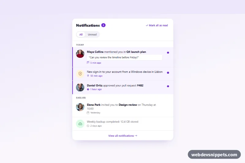
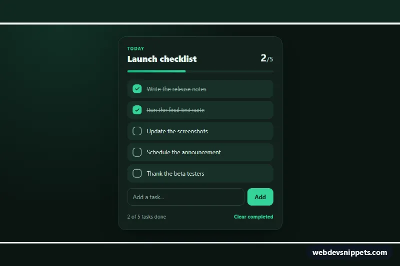
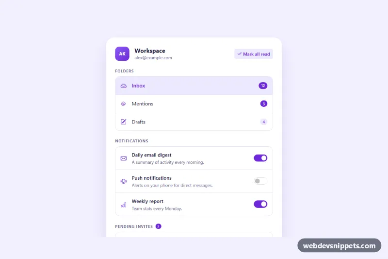
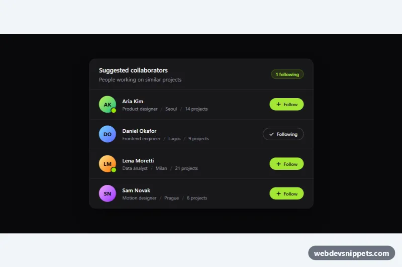
A Bootstrap 5 notification list with highlighted unread items, a live unread counter, an All / Unread filter and a "Mark all as read" action. Use it as a notification center page, inside a header dropdown or in the sidebar of a dashboard or social app.
How it works
The panel is a Bootstrap card with the class .nl-panel, wrapped in .nl-wrap for the soft violet background. The header holds the title, the .nl-count badge, the .nl-mark-all button and a segmented filter built from two btn-check radio inputs. Notifications are grouped in .nl-group blocks ("Today", "Earlier"). Each li.nl-item is a three-column grid: an avatar photo (.nl-avatar) or an icon circle (.nl-icon), the .nl-link with text, optional quote and time, and a .nl-toggle button showing the unread dot. Unread items carry .is-unread, which adds the tinted background, the inset accent bar on the left, darker text and a filled dot. A pseudo-element on .nl-link makes the whole row clickable.
The script initialises every .nl-panel on DOMContentLoaded and gives each instance unique radio names and ids. Clicking a notification link marks it read; clicking .nl-toggle switches between read and unread. A render() function recounts unread items, updates or hides the badge, disables "Mark all as read" when nothing is unread, applies the current filter, hides empty groups and shows the .nl-empty "You're all caught up" state when no item is visible.
Customization
--nl-accentand--nl-accent-softon.nl-wrapinstyle.css: change the violet used for the badge, dots, accent bar, times and buttons.--nl-unread-bg: change the background tint of unread rows.--nl-avatar: resize avatars and icon circles (default44px); the grid column follows.- Add or remove
.is-unreadon any.nl-itemto set the initial state; the counter is calculated on load. .nl-icon--warnand.nl-icon--ok: copy one of these modifiers to create more colored icon types for system messages.max-width: 540pxin.nl-panel: make the panel narrower for a header dropdown.- The
event.preventDefault()line in the.nl-linkclick handler: remove it and set realhrefvalues to open each notification.
Use cases
- Dashboards and admin panels: a notification center page with an unread counter and a Mark all as read button
- Social and community apps: activity items with avatars and quotes switch between read and unread
- Header dropdowns: a narrow notification panel that opens from the bell icon in the top bar
- SaaS products: filter system messages between All and Unread and show an all caught up empty state
- Sidebars: grouped Today and Earlier notifications keep recent activity easy to scan
Accessibility
The panel is a labelled section. Each link starts with a visually hidden "Unread:" or "Read:" prefix that the script keeps in sync, and the badge includes a hidden "unread" word. The toggle buttons have an aria-label that switches between "Mark as read" and "Mark as unread". The filter is a radiogroup of native radio inputs, so arrow keys work. A visually hidden role="status" region announces every change, and focus moves to the next item or the filter when an item disappears or all items are marked read. Transitions are disabled with prefers-reduced-motion.
Usage notes
Requires Bootstrap 5 (added automatically) and Bootstrap Icons. .nl-wrap is a demo wrapper with min-height: 100vh; drop it when placing the panel in a dropdown. Read state is kept only in the page; save it with fetch() in the click handlers. The avatar photos come from Unsplash; replace them with your own images.