Skip to content

Banking App Welcome and Permissions

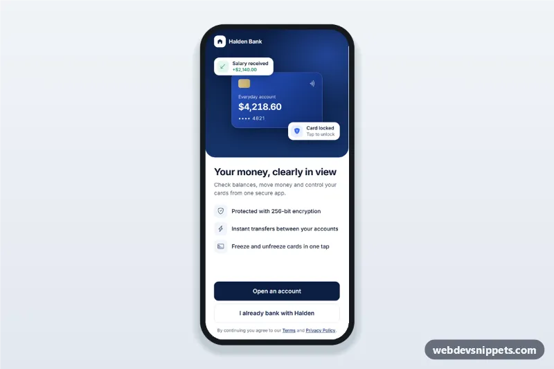
Banking app welcome screen with a notifications and Face ID permission flow, clear explanations, Allow and Not now buttons and a setup summary.

Also known as: banking app onboarding screen, push notification permission screen, face id permission ui, fintech app welcome screen, mobile bank app ui

Banking App Welcome and Permissions live demo

Open in new tab

Bootstrap 5 code (HTML, CSS, JS)

An HTML mobile template for a banking app: a welcome screen followed by a notification permission step, a Face ID permission step and a short setup summary. It works as a fintech onboarding screen for mobile sites and PWAs, and it can be packaged as a native app with Capacitor. Built with Bootstrap 5, Bootstrap Icons and Inter.

How it works

The root .bwp-app is a centred app column (max 430 px) with four section.bwp-step panels, each marked with data-step-panel: welcome, notify, faceid and done.

The welcome panel has a navy .bwp-hero with a CSS card illustration and two floating info chips, then the headline, three .bwp-features and the two buttons. The permission panels share the same layout: a .bwp-bar with a back button and a two-segment .bwp-progress, a large icon, the explanation list .bwp-list, and a sticky .bwp-footer with Allow and Not now.

The script listens for clicks on [data-go] (navigate to a step), [data-skip] (decline) and [data-allow] (accept). Allow shows a spinner for 700 ms to simulate the system prompt, then stores the choice and moves on. The .bwp-summary pills on the last step show On or Off for each permission.

Customization

  • --bwp-navy and --bwp-navy-2 on .bwp-app: change the brand colours of the hero, buttons and icons.
  • --bwp-green on .bwp-app: changes the check icons and the On pill.
  • --bwp-radius on .bwp-app: rounds the preview card, privacy box and summary list.
  • height: 348px on .bwp-hero: make the welcome illustration area taller or shorter.
  • The window.setTimeout in the [data-allow] handler in script.js: replace it with Notification.requestPermission() or your Capacitor biometric plugin and pass the real result to next().
  • data-go="welcome" on "Go to my accounts": in this demo it restarts the flow; point it to your dashboard route.
  • Remove a whole [data-step-panel] section and its key in the order object to drop a step.

Use cases

  • Banking and credit union apps: introduce the app, then ask for alerts and biometric sign-in
  • Fintech and budgeting PWAs: explain why push notifications matter before the browser prompt appears
  • Payment and wallet apps: offer Face ID or fingerprint approval for transfers
  • Insurance or brokerage apps: a calm, trustworthy first-run flow before the account dashboard

Accessibility

Each step is a section labelled by its heading. When the step changes, focus moves to that heading, and a visually hidden role="status" region announces "Notifications turned on." or "Face ID skipped.". The progress bars use role="progressbar" with aria-valuetext such as "Step 1 of 2". Icon-only back buttons have aria-label values, decorative icons are aria-hidden, all buttons are at least 44 px tall and keyboard operable, and the step slide-in animation only runs when prefers-reduced-motion allows it.

Usage notes

Requires Bootstrap 5 and Bootstrap Icons; Inter comes from Google Fonts. Call the native permission APIs inside the Allow click handler.
Banking App Welcome and Permissions at a glance

Framework
Bootstrap 5
Code
HTML, CSS, JavaScript
JavaScript
Vanilla JavaScript, no jQuery
Dependencies
Bootstrap 5, Bootstrap Icons, fonts.googleapis.com
Layout
Mobile-first app screen, centred on wider screens
Category
Onboarding Screens
License
Free for personal and commercial use

Questions about this template

Can I use the Banking App Welcome and Permissions code for free?

Yes. You can copy or download the code and use it in personal and commercial projects, including client work. No sign-up is needed. Reselling it as part of a component library or template collection is not allowed; see the license.

How do I add it to my website?

Load Bootstrap 5 and Bootstrap Icons and fonts.googleapis.com from a CDN (the links are under Requirements). Paste the HTML where the component should appear, add the CSS to your stylesheet and load the JavaScript before the closing </body> tag. Download HTML gives you a complete page with everything already linked.

Does it need jQuery or a JavaScript framework?

No. The script is plain vanilla JavaScript, so it works without jQuery, React or Vue. You can still use the markup inside those frameworks.

Can I turn this screen into an iOS or Android app?

Yes. It is plain HTML, CSS and JavaScript, so it works in a mobile website or progressive web app as it is. To ship it as a store app, put it in the web folder of a Capacitor or Cordova project and build it for iOS and Android; replace the sample data with calls to your own API.

How does it look on a desktop screen?

The screen is designed for phones. On wider screens it stays at phone width in the middle of the page, so it still looks like an app. The live demo opens at mobile width; use the Tablet and Desktop buttons to check other sizes.

Requirements

Add these to your page (already included in the download):

  • <link rel="stylesheet" href="https://cdn.jsdelivr.net/npm/bootstrap@5.3.3/dist/css/bootstrap.min.css">
  • <script src="https://cdn.jsdelivr.net/npm/bootstrap@5.3.3/dist/js/bootstrap.bundle.min.js"></script>
  • <link rel="stylesheet" href="https://cdn.jsdelivr.net/npm/bootstrap-icons@1.11.3/font/bootstrap-icons.min.css">
  • <link rel="stylesheet" href="https://fonts.googleapis.com/css2?family=Inter:wght@400;500;600;700&display=swap">
Banking App Welcome and Permissions – Bootstrap 5 onboarding screens component screenshot
Banking App Welcome and Permissions · Bootstrap 5 Onboarding Screens

More Onboarding Screens

Language Learning App Onboarding – Bootstrap 6 onboarding screens preview

Language Learning App Onboarding

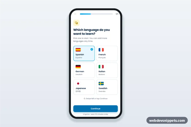
Language learning app onboarding screen with flag language picker, level choice, daily goal and progress bar: a three-step mobile app onboarding flow with swipe support.

News App Topic Picker Onboarding – Tailwind CSS onboarding screens preview

News App Topic Picker Onboarding

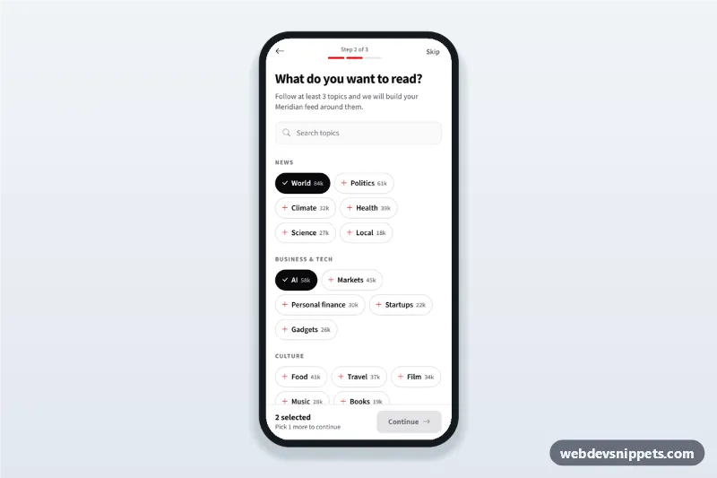
News app topic picker onboarding screen: follow topics as chips with follower counts, search them and continue once three interests are selected.

Meditation App Onboarding with Goals – Pure CSS onboarding screens preview

Meditation App Onboarding with Goals

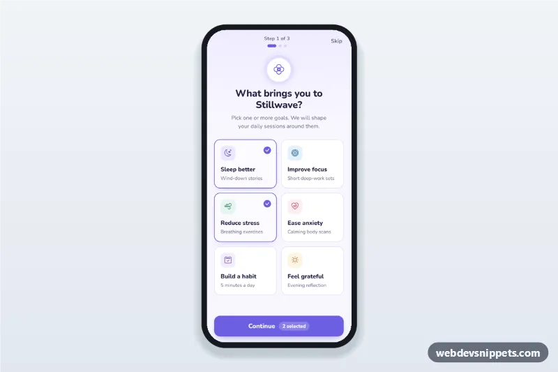
Meditation app onboarding screen where users pick goals as selectable cards, set a daily reminder time and days, then see their plan, with a step counter.

Fitness App Onboarding Screens – Tailwind CSS onboarding screens preview

Fitness App Onboarding Screens

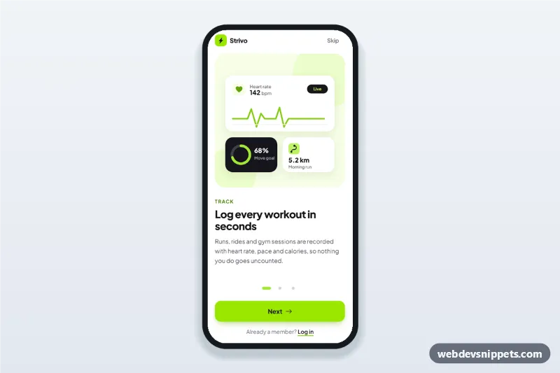
Fitness app onboarding screens with three swipeable steps, SVG illustrations, progress dots, Skip and Get started, built as a mobile app intro walkthrough.