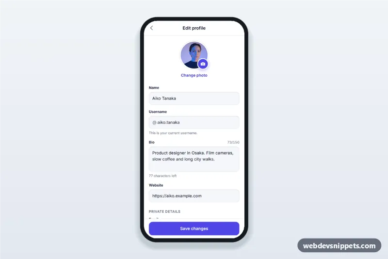
Edit Profile Screen with Avatar Picker
Edit profile screen for mobile apps with an avatar picker bottom sheet, username availability check, bio character counter, validation and a sticky save button.
HTML mobile templates: app-style screens for phones, ready for mobile websites, PWAs and Capacitor apps.
10 components
Edit profile screen for mobile apps with an avatar picker bottom sheet, username availability check, bio character counter, validation and a sticky save button.
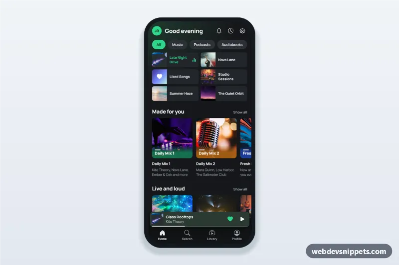
Music streaming app home screen in dark mode with greeting, recently played grid, made for you playlist row, mini player above the tab bar and a full player bottom sheet.
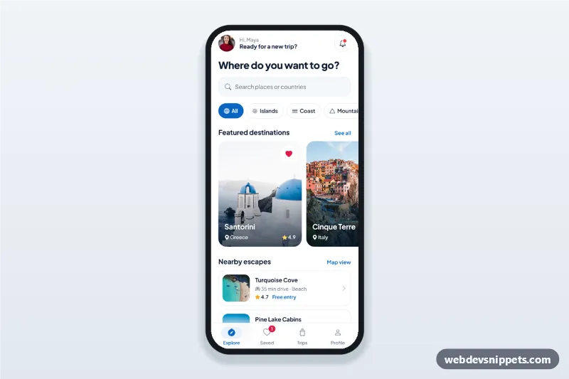
Travel app explore screen with destination search, category chips, featured destination cards in a horizontal scroll, nearby list, bottom sheet details and bottom tab bar.
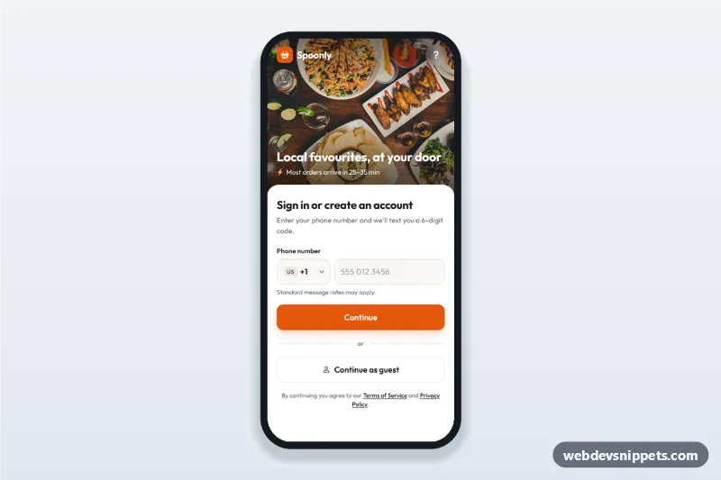
Food delivery app phone login screen with searchable country code picker, SMS code step and continue as guest: a mobile phone number sign-in UI with a food photo header.
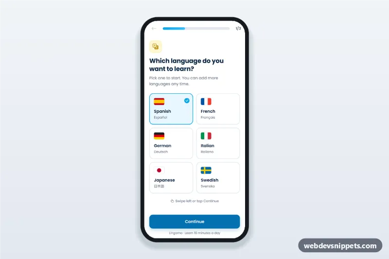
Language learning app onboarding screen with flag language picker, level choice, daily goal and progress bar: a three-step mobile app onboarding flow with swipe support.
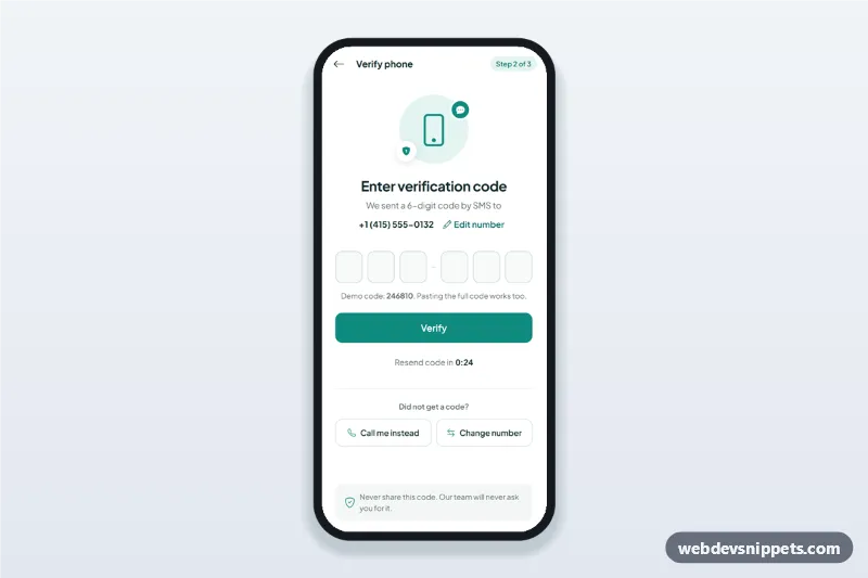
OTP verification screen with six one-digit code inputs, auto advance, paste and one-time-code autofill, a resend timer and an edit phone number sheet.
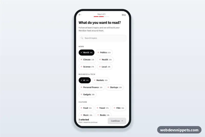
News app topic picker onboarding screen: follow topics as chips with follower counts, search them and continue once three interests are selected.
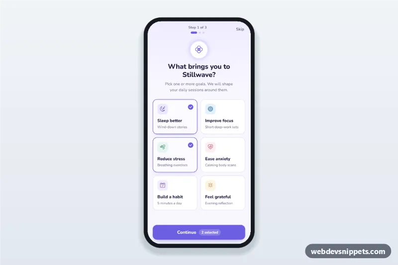
Meditation app onboarding screen where users pick goals as selectable cards, set a daily reminder time and days, then see their plan, with a step counter.
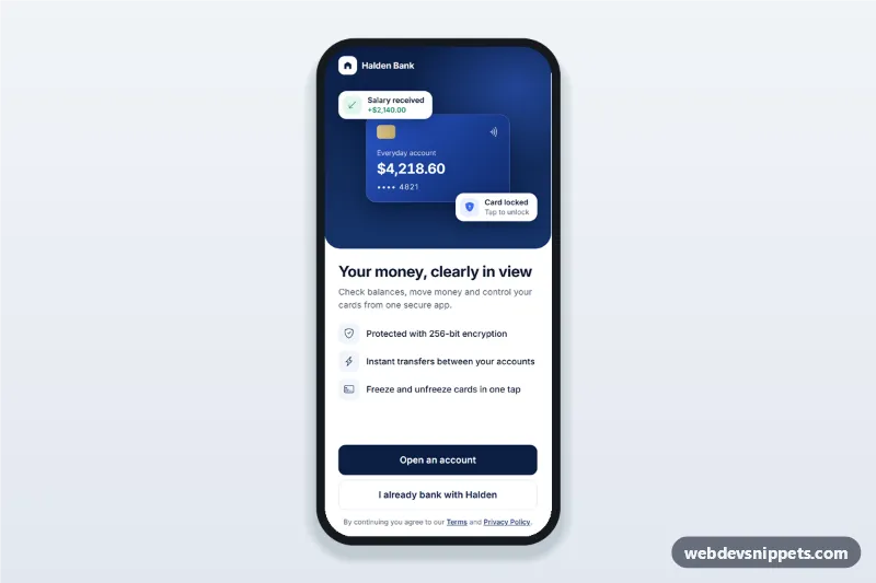
Banking app welcome screen with a notifications and Face ID permission flow, clear explanations, Allow and Not now buttons and a setup summary.
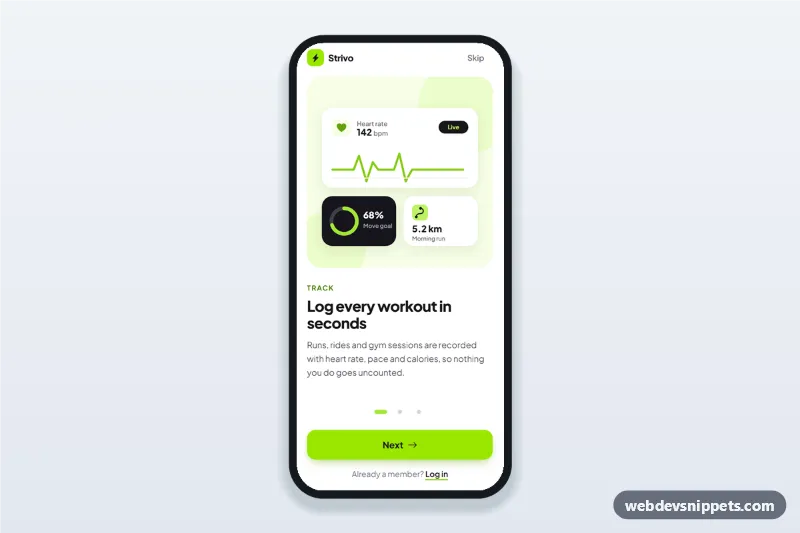
Fitness app onboarding screens with three swipeable steps, SVG illustrations, progress dots, Skip and Get started, built as a mobile app intro walkthrough.
HTML mobile templates are app-style screens designed for phones first: onboarding, login, home feeds, profiles, shopping, chat, settings, dashboards and booking flows. They use tab bars, bottom sheets, large touch targets and single-column layouts instead of a desktop page squeezed onto a small screen.
Use them for mobile websites, progressive web apps and prototypes. Because they are plain HTML, CSS and JavaScript, the same screens can be packaged as iOS and Android apps with Capacitor or Cordova, or used as a visual starting point for a React Native or Flutter app.
env(safe-area-inset-*) and viewport-fit=cover.email, tel, number) so phones show the right keyboard.Each screen is available in one of Bootstrap 6, Bootstrap 5, Tailwind CSS or pure CSS. The live preview opens at phone width; switch to tablet or desktop to see how the screen stays centred on larger displays. Copy the HTML, CSS and JavaScript or download the complete page, replace the sample data and connect it to your own API.