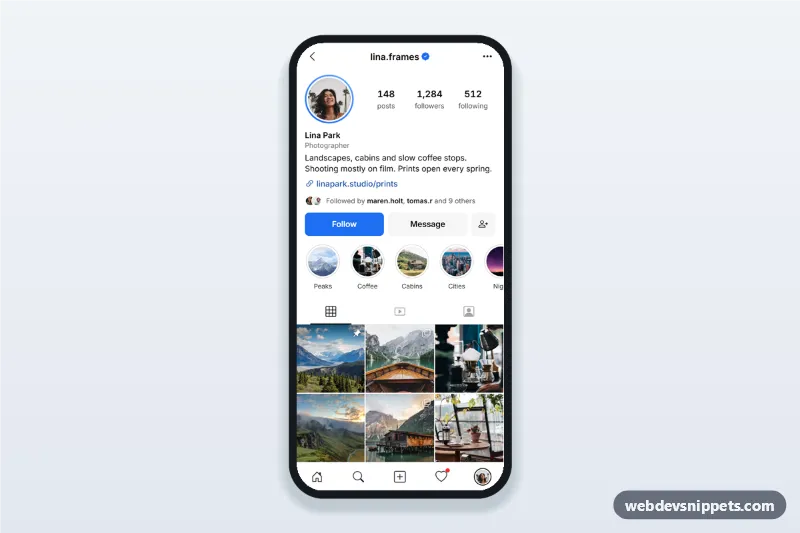
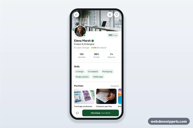
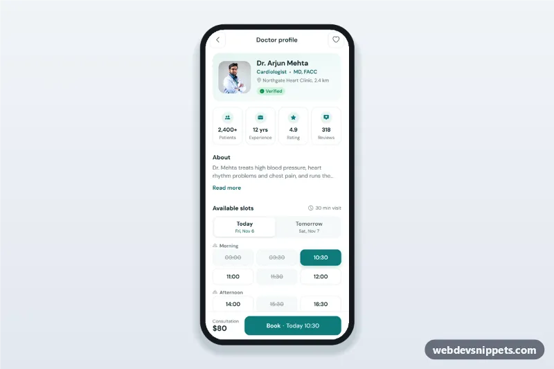
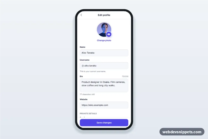
A social profile screen built with Tailwind CSS: avatar, name, bio, follower stats, Follow and Message buttons, story highlights, posts, reels and tagged tabs and a three-column photo grid. It is an HTML mobile template for mobile websites and PWAs and can be packaged as a native app with Capacitor. Use it as the profile page of a photo sharing app or creator community.
How it works
The root .spg-app is a phone-width column with a sticky top bar, a sticky role="tablist" row and a sticky .spg-tabbar. Each .spg-tab controls one grid panel (#spg-panel-posts, #spg-panel-reels, #spg-panel-tagged); selectTab() in script.js sets aria-selected, roving tabindex and the hidden attribute, and the Arrow, Home and End keys move between tabs.
The Follow button ([data-spg-follow]) is a toggle with aria-pressed. It switches to Following and adds one to the count in data-spg-count.
Every .spg-tile is a button. Tapping one opens #spg-viewer, a full-screen native <dialog> that shows the photo, the caption from data-spg-caption and the like count from data-spg-likes. The Message button opens #spg-message, a bottom sheet with a required textarea: an empty message shows an inline error, a valid one is "sent" after a short timeout and a toast confirms it. The three-dot button opens #spg-more with share, copy link, mute and report options. Sheets close with Escape, a tap on the backdrop or the close buttons, and focus returns to the button that opened them.
Customization
--spg-accentand--spg-accent-presson.spg-appinstyle.css: colour of the Follow and Send buttons, the verified badge and focus rings..spg-avatar-ringinstyle.css: change the conic gradient around the avatar or remove the class for a plain photo.- Add a post by copying a
.spg-tilebutton and settingdata-spg-captionanddata-spg-likes; add.spg-badgeicons for pinned or multi-photo posts. .spg-tile--reelsets the 2:3 shape of the reels grid; changeaspect-ratiothere for 9:16 tiles.data-spg-counton[data-spg-followers]: the starting follower number used by the Follow toggle.- Replace the
setTimeoutin the message form submit handler withfetch()to your messaging API.
Use cases
- Photo sharing apps: a member profile with posts, reels and tagged photos.
- Creator and portfolio communities: photographers or artists showing work with a follow button.
- Social features inside other apps: a traveller or recipe author profile in a PWA.
- Prototypes and pitch demos: a realistic social media UI to test with users.
Accessibility
Tabs follow the WAI-ARIA tabs pattern, icon-only buttons have aria-label, toggles use aria-pressed and the active tab bar item has aria-current="page". Sheets are modal <dialog> elements with labels, the form error is linked with aria-describedby and announced through aria-live, and toasts use role="status". Touch targets are at least 44 px and animations respect prefers-reduced-motion.
Usage notes
The photos come from Unsplash; replace them with your own images. Bootstrap Icons and the Inter font are loaded from CDNs.