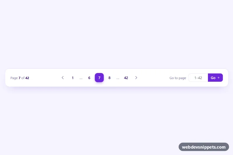
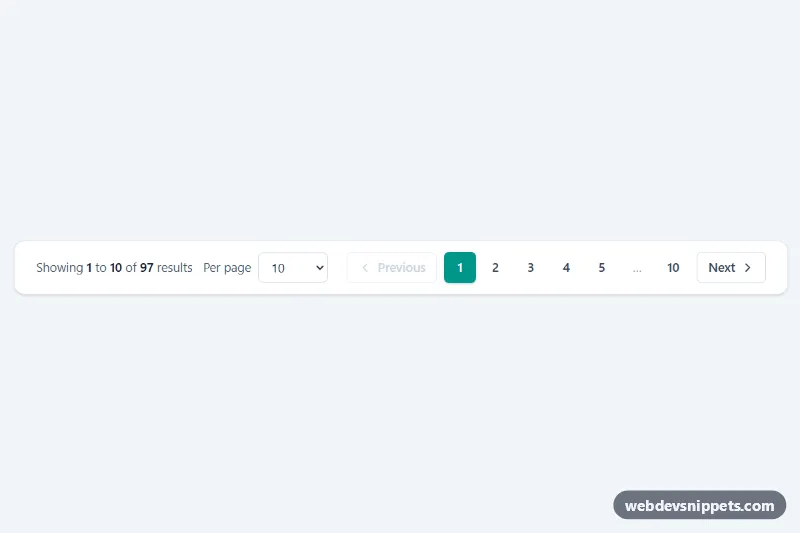
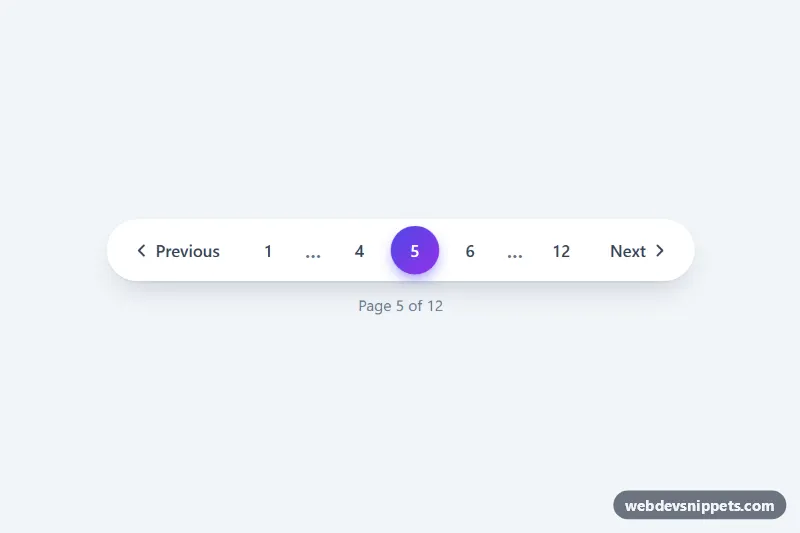
A Bootstrap 5 pagination bar with smart ellipses, previous and next arrows, a "Page 7 of 42" counter and a "Go to page" field for jumping straight to any page. It suits search results, data tables, archives and admin lists with many pages.
How it works
The root .pgj stores its state in data attributes: data-pgj-total, data-pgj-current and data-pgj-siblings. It holds three parts: the .pgj-info counter, a nav with Bootstrap's ul.pagination.pgj-pages, and the form.pgj-jump with a number input and a Go button. The markup ships pre-rendered for page 7, so it looks complete before the script runs.
On DOMContentLoaded the script reads the attributes and rebuilds the list with render(). The helper buildPages() always keeps the first and last page, shows data-pgj-siblings pages on each side of the current one and inserts a .pgj-gap item where pages are skipped. Previous and next become disabled span elements on the first and last page. Clicks on any a[data-page] are handled by one delegated listener that calls goTo(), re-renders the list, moves focus back to the same arrow or to the new current page, updates data-pgj-current and fires a bubbling pgj:change event with detail.page and detail.total.
The jump form checks that the value is a whole number between 1 and the total. Invalid input gets is-invalid, aria-invalid="true" and shows .pgj-error; typing again clears the error.
Customization
data-pgj-totalanddata-pgj-currenton.pgj: set the number of pages and the starting page; the inputmax, placeholder and error text update automatically.data-pgj-siblingson.pgj: use2to show two pages on each side of the current page, or0for a compact bar.--pgj-accentinstyle.css: recolors the active page, Go button and focus rings.--pgj-size: changes the width and height of each page button (it shrinks to2.1remon phones).--pgj-radius: use50%for round page buttons or0.25remfor sharper ones.- Listen for
pgj:changeon.pgj, or editgoTo()inscript.js, tofetch()the rows for the new page.
Accessibility
The list sits in a nav labelled "Results pages", and the current page has aria-current="page". Arrow links have aria-label values "Previous page" and "Next page", disabled arrows use aria-disabled, and ellipsis items are aria-hidden. The counter is a role="status" live region, so page changes are announced. The field has a visible label, aria-describedby points to the error message and aria-invalid reflects its state. Focus is kept inside the pagination after each change, and every control has a visible focus ring.
Usage notes
Requires Bootstrap 5 (added automatically) and Bootstrap Icons. For several instances on one page, give each input a unique id and update the for and aria-describedby values.