A rounded pagination bar in pure CSS and vanilla JavaScript, with pill-shaped page buttons, ellipsis gaps, previous and next controls and a gradient active page. It suits blog archives, search results, product listings and data tables.
How it works
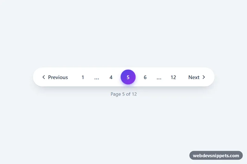
The root nav.pg-pagination carries three data attributes: data-total (number of pages), data-current (the active page) and data-siblings (pages shown on each side of the active one). Inside, ul.pg-list is a white pill that holds .pg-btn buttons: .pg-prev, numbered .pg-page buttons, .pg-ellipsis items and .pg-next. Below it, .pg-status shows text such as "Page 5 of 12".
On DOMContentLoaded the script initializes every .pg-pagination and renders the list from the data attributes. getItems() always shows the first and last page, the current page with its siblings, and an ellipsis where pages are skipped. The number of slots stays constant, so the bar barely changes width while you page through. A single click listener on .pg-list reads data-page from the clicked button, updates the state, re-renders and fires a pg:change event on the root with detail.page and detail.total. Listen to that event to load the matching results. The static markup already shows page 5 of 12, so the bar looks correct before the script runs.
On screens narrower than 560px the script shows only the current page between the ellipses, and the "Previous" and "Next" words are visually hidden, leaving compact arrow buttons.
Customization
data-total="12"anddata-current="5"on.pg-pagination: set the real page count and starting page.data-siblings="1": use2to show two neighbours on each side of the active page on wider screens.--pg-accentand--pg-accent-2: the gradient of the active page, the hover text color and the glow below the active button.--pg-size: button height and minimum width; it is2.5remon phones and2.75remfrom 560px.--pg-bgand--pg-hover: the pill background and the hover background of the buttons.--pg-focus: color of the keyboard focus outline.- Remove
.pg-statusif you do not need the "Page X of Y" text.
Accessibility
The bar is a nav landmark with aria-label="Pagination". Every number has an aria-label such as "Page 4", the active one has aria-current="page", and the arrows are named "Previous page" and "Next page". On the first and last page the matching arrow gets the disabled attribute. Ellipsis items are aria-hidden. After each change focus stays on the arrow you pressed, or moves to the new current page, and .pg-status is an aria-live="polite" region that announces the new page. All buttons show a visible :focus-visible outline, and the press animation is disabled with prefers-reduced-motion: reduce.
Usage notes
Several bars can share a page; each keeps its own state. Use the pg:change event to fetch data or update the URL.