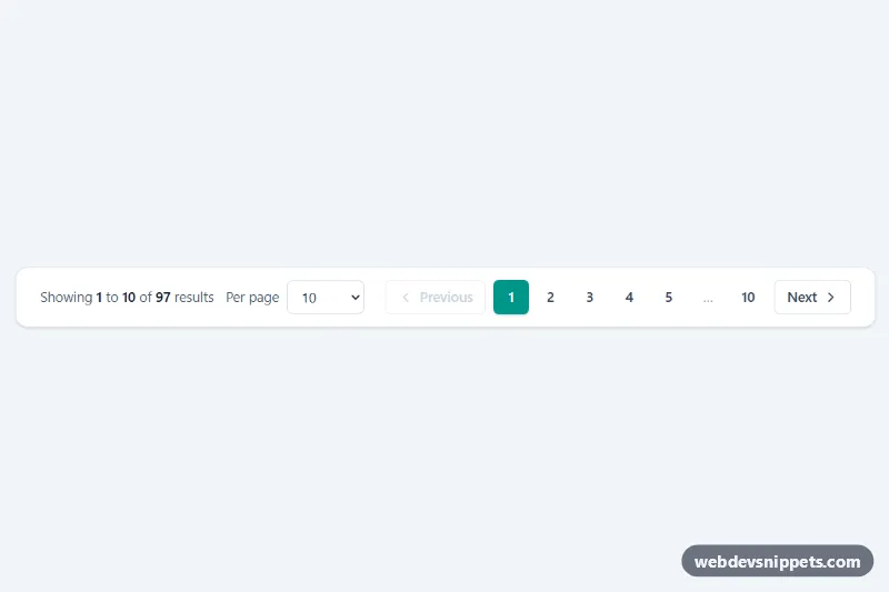
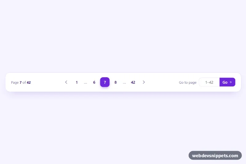
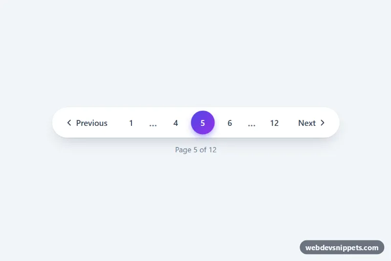
A Tailwind CSS pagination bar that pairs numbered page links and Previous/Next buttons with a "Showing 1 to 10 of 97 results" summary and a per-page selector. It fits under data tables, search results, order histories and admin lists where users need to know both where they are and how much is left.
How it works
The root element is .tpr-pagination. Its data attributes hold the whole state: data-total (number of results), data-per-page and data-page. Inside a nav landmark the left side contains the summary paragraph, whose numbers live in data-tpr-from, data-tpr-to and data-tpr-total, plus the data-tpr-size select. The right side holds the data-tpr-prev and data-tpr-next buttons and the page list data-tpr-list.
On DOMContentLoaded the script initializes every .tpr-pagination on the page. render() clamps the current page, calculates the visible range and rebuilds the page list from getPages(). That function always returns at most seven slots (for example 1 2 3 4 5 … 10 or 1 … 4 5 6 … 10), so the bar keeps the same width while you click through. Previous and Next are disabled on the first and last page. Changing the per-page value keeps the first visible result on screen by recalculating the page.
Below the sm breakpoint the number list is hidden and a compact "Page 1 of 10" label (data-tpr-current, data-tpr-pages) sits between the arrows. Every change fires a bubbling tpr:change event whose detail contains page, perPage, from, to and total; listen for it to load the matching rows with fetch().
Customization
data-total,data-per-pageanddata-pageon.tpr-pagination: set the result count, page size and starting page; the summary and links update automatically.ACTIVE_CLASSandIDLE_CLASSat the top ofscript.js: swaptealforindigoorroseto recolor the current page and hover state (update thetealclasses inindex.htmlto match).getPages()inscript.js: change the slot logic to show more or fewer numbers around the current page.- The
optionelements insidedata-tpr-size: offer other page sizes such as 20, 40 or 100, or delete the wholelabelto hide the selector. rounded-xl,borderandshadow-smon thenav: remove them to place the bar flush under an existing table.rounded-mdinBASE: userounded-fullfor circular page buttons.
Accessibility
The bar is a nav with aria-label="Results pagination". The current page button has aria-current="page" and every number has an aria-label such as "Page 4"; the ellipsis is aria-hidden. The summary paragraph is an aria-live="polite" region, so screen readers announce the new range after each change. Disabled arrows use the native disabled attribute. After the list is rebuilt, focus moves to the new active page or to the opposite arrow when the pressed one becomes disabled, so keyboard users never lose their place. All controls show a teal focus outline and transitions are disabled with motion-reduce.
Usage notes
The buttons are client-side only. For server-rendered lists, replace them with a elements that link to ?page=N and keep the same classes.