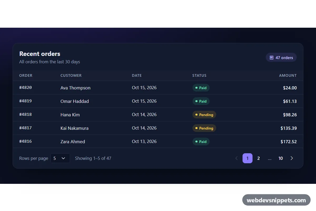
A dark Bootstrap 5 data table footer that combines a rows-per-page select, a "Showing 1–5 of 47" range text and a windowed pagination bar with ellipsis. Use it under order lists, admin tables, search results or any long list that needs client-side paging.
How it works
The root section.pp-wrap sets data-bs-theme="dark", so Bootstrap's own form and table styles switch to their dark color mode. Inside, .pp-panel holds a header, a table.pp-table wrapped in table-responsive, and the .pp-foot bar. The footer contains the select.pp-size with its label, the .pp-range text and an empty ul.pagination.pp-pages.
On DOMContentLoaded the script initializes every .pp-wrap. It builds sample orders from the count in data-pp-total, then renders the current slice into tbody.pp-rows and rebuilds the pager. The pageList() helper always shows the first and last page, the current page and one neighbor on each side, and collapses everything else into an ellipsis, so the bar stays short even with many pages. Previous and next buttons are disabled on the first and last page.
A click listener on the pager reads data-page from the clicked button and calls go(). A change listener on the select recalculates the page so the first visible row stays in view: if you are looking at rows 11–15 and switch to 10 per page, you land on page 2 with rows 11–20. Each status is shown with a .pp-badge--paid, .pp-badge--pending or .pp-badge--refunded pill.
Customization
data-pp-totalon.pp-panel: the number of sample rows. ReplacebuildOrders()inscript.jswith data from your API or afetch()call.<option>values inselect.pp-size: offer other page sizes; mark a different oneselectedto change the default.Math.abs(p - current) <= 1inpageList(): use<= 2to show two neighbors on each side of the current page.--pp-accentin.pp-wrap: changes the active page button and the focus border of the select; pair it with--pp-accent-inkfor the active page number color.--pp-bg,--pp-paneland--pp-line: set the page background, panel color and divider lines.max-width: 920pxin.pp-panel: make the table wider or narrower.currency: 'USD'in theIntl.NumberFormatcall: format amounts in another currency.
Use cases
- Admin dashboards: lets staff choose how many orders show per page and jump through long tables
- Order and invoice lists: shows a Showing 1–5 of 47 range with paid, pending and refunded status pills
- Search results pages: pages through long result lists with a windowed pager that stays short
- Internal tools: keeps the first visible row in view when the page size changes
Accessibility
The pagination sits in a nav labelled "Orders pages". Every page button has an aria-label such as "Page 3", the active one has aria-current="page", and the chevron buttons are labelled "Previous page" and "Next page" with their icons hidden from screen readers. Ellipsis items are aria-hidden. After a click, focus moves to the matching button in the re-rendered list, so keyboard users do not lose their place. The .pp-range text is a polite live region that announces the new range. The select has a visible label, and the table has a visually hidden caption.
Usage notes
Requires Bootstrap 5.3 for data-bs-theme (added automatically) and Bootstrap Icons for the chevrons. Each .pp-wrap keeps its own state, so several tables can share a page. Without JavaScript the table shows a loading row.