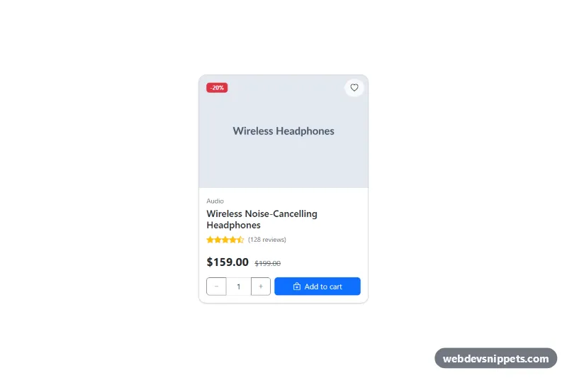
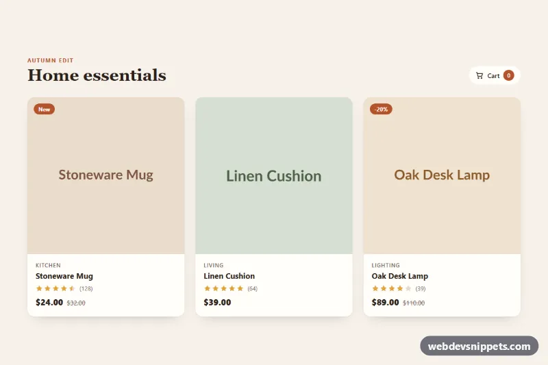
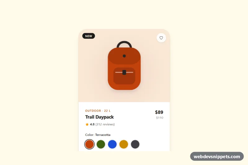
A Bootstrap 5 e-commerce product card with a discount badge, wishlist heart, star rating, sale price, quantity stepper and add-to-cart button. Use it in product grids, shop landing pages or featured product sections.
How it works
The card is an article.card.pc-card capped at 360px wide with rounded corners. The top area is a position-relative wrapper holding a placeholder image (card-img-top, forced to a 3:2 aspect-ratio), a badge text-bg-danger discount label and the round .pc-wish button. The card-body contains the category, title, a star row built from Bootstrap Icons, the current price and the struck-through old price, and a row with the .pc-qty input group and the .pc-add button. Below it, .pc-status stays hidden through :empty until it has text.
The script runs on DOMContentLoaded for every .pc-card. Buttons with data-qty="-1" and data-qty="1" add their value to the number input, and a clamp() helper keeps the result between the input's min and max. A change listener re-clamps typed values. Clicking .pc-add writes a message such as "2 items added to your cart." into .pc-status. Clicking .pc-wish toggles aria-pressed, swaps the icon between bi-heart and bi-heart-fill and updates the button label; the CSS turns the filled heart red with var(--bs-danger).
Customization
min="1" max="10"on the quantity input: change the allowed range; the script reads both values, so the stepper respects them.max-width: 360pxin.pc-card: make the card wider or narrower in your grid.aspect-ratio: 3 / 2in.pc-card .card-img-top: use1 / 1for square product shots.text-bg-dangeron the discount badge: change its color or remove the badge for full-price items.btn-primaryon.pc-add: switch tobtn-darkorbtn-successto match your store.color: var(--bs-danger)in.pc-card .pc-wish[aria-pressed="true"] .bi: changes the color of the active wishlist heart.- The status text in the
.pc-addclick handler inscript.js: replace it with a call to your own cart API. width: 8.5remin.pc-card .pc-qty: adjust the width of the quantity control.
Accessibility
The wishlist button uses aria-pressed and an aria-label that changes between "Add to wishlist" and "Remove from wishlist". The star row is a single role="img" element labelled "Rated 4.5 out of 5". The old price includes a visually-hidden "Was" prefix so it is not read as a second price. The quantity group has role="group" with a label, and the minus and plus buttons have descriptive aria-label values. .pc-status is a role="status" live region, so the cart confirmation is announced. Native spin buttons are hidden, but the field still accepts arrow keys and typing.
Usage notes
Requires Bootstrap 5 (added automatically) and Bootstrap Icons. Repeat the article.pc-card in a Bootstrap row for a product grid; each card works independently.