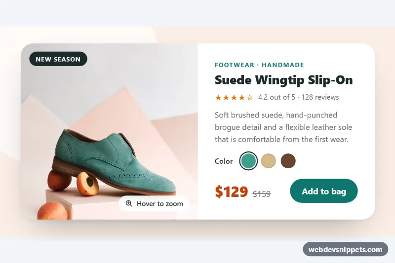
A pure CSS product card with a large photo that zooms in smoothly when the shopper hovers over the card or tabs into it. It pairs the image with a category line, star rating, short copy, color swatches, a sale price and an add-to-bag link, and suits shop grids, featured product blocks and landing pages.
How it works
The wrapper .pz-stage sets all colors and sizes as custom properties and centers one article.pz-card. The card is a CSS grid: a single column on phones and two equal columns from 640px, with .pz-media on the left and .pz-body on the right. .pz-media has overflow: hidden and holds the .pz-img photo, the .pz-tag label and the .pz-hint pill.
The zoom is a transform: scale() on .pz-img with an eased transition. It is triggered by .pz-card:hover and .pz-card:focus-within, so keyboard users see the same effect when the swatches or the button get focus. At the same moment the hint pill fades and slides away. The image uses transform-origin: var(--pz-x) var(--pz-y).
The small script.js is optional. On devices with a fine pointer it listens for pointermove on .pz-media and writes the cursor position into --pz-x and --pz-y, so the area under the cursor is magnified. On pointerleave the values are removed and the origin returns to the default. Without JavaScript the card still zooms toward the center.
The swatches are real radio buttons inside a fieldset.pz-swatches; :has(input:checked) draws the ring around the selected .pz-swatch.
Customization
--pz-zoomon.pz-stage: the scale factor on hover, e.g.1.15for a subtle zoom or1.6for a close-up.--pz-speed: duration of the zoom transition; raise it for a slower, more cinematic move.--pz-xand--pz-yon.pz-media: the default zoom origin (currently50%and55%) used before the pointer moves and without JavaScript.--pz-accentand--pz-accent-dark: the button color, its hover color and the category text.--pz-sale: the color of.pz-price-now; set it to--pz-textfor items that are not on sale and remove.pz-price-old..pz-swatch--teal,.pz-swatch--sandand.pz-swatch--cocoa: each sets--pz-dot; add a modifier for more colors.grid-template-columnsin the640pxmedia query: use1.2fr 1frto give the photo more room.
Accessibility
The card is an article labelled by its heading through aria-labelledby. The photo has a descriptive alt, and the decorative hint is aria-hidden. The swatches are a native radio group with a legend, so arrow keys work and screen readers announce each color name from the visually hidden .pz-sr text. The old price is announced as "Was". Swatches and the button show a clear focus outline. With prefers-reduced-motion: reduce the scaling is replaced by a slight brightness change, and on touch screens the hint is hidden.
Usage notes
The photo comes from Unsplash; replace it with your own product image. Use a different name on the radio inputs for every card on the page.