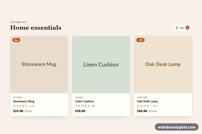
Product Card with Quick Actions
Responsive product card grid where hover or focus reveals wishlist, quick view and add-to-cart actions, with star ratings and a native quick view dialog.
Single product tiles with price and actions.
3 component(s)
Responsive product card grid where hover or focus reveals wishlist, quick view and add-to-cart actions, with star ratings and a native quick view dialog.
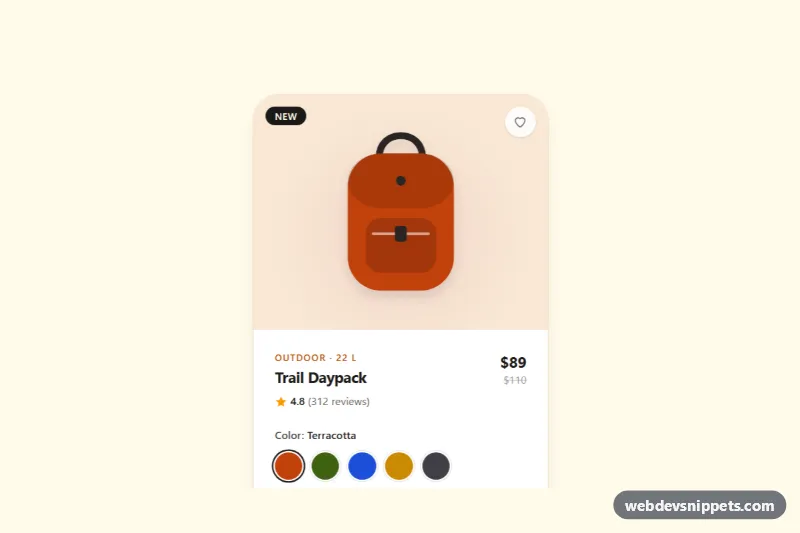
Tailwind CSS product card with live-recoloring color swatches, a size selector with sold-out state, wishlist toggle and add to bag button.
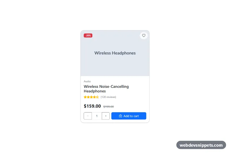
Bootstrap 5 product card with sale badge, star rating, price, quantity stepper and add-to-cart feedback.
A product card is a compact tile that represents a single product in an online store. It typically shows a product image, name, price, optional rating and badges such as "New" or "-20%", plus actions like "Add to cart", "Add to wishlist" or "Quick view". Product cards are the building blocks of category pages, search results, related-product rows and homepage carousels.
Use a heading for the product name and give the image meaningful alt text. When the old price is shown with <del>, add visually hidden text such as "Original price" and "Sale price", because the strike-through is not announced. Icon-only wishlist buttons need an aria-label and aria-pressed for the saved state. Avoid nesting buttons inside links. Set width and height on images and use loading="lazy" for cards below the fold to keep the page fast and stable.
These product card HTML CSS examples and bootstrap product card snippets come in Bootstrap 6, Bootstrap 5, Tailwind CSS and pure CSS. Bootstrap versions build on the card component, with Bootstrap 6 using theme-* colour roles for badges and buttons. Filter by framework, look at the live preview, then copy the HTML and CSS from the code tabs or download the card and connect the button to your own cart logic.