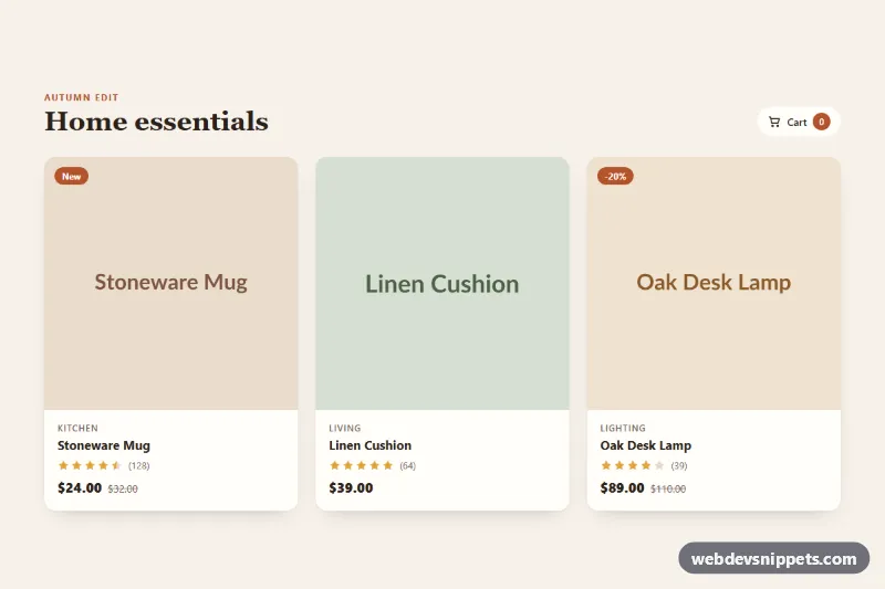
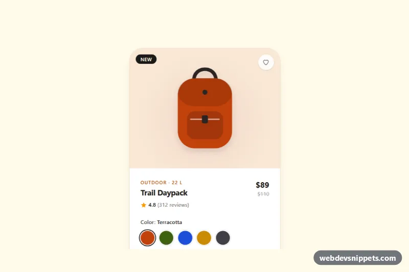
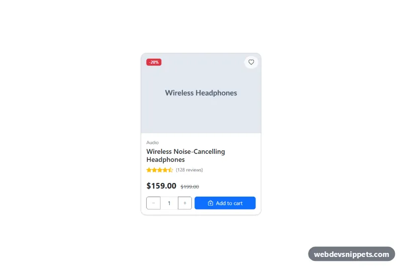
A responsive grid of e-commerce product cards built with pure CSS and vanilla JavaScript. Hovering a card reveals a wishlist heart and an action bar with Quick view and Add to cart, while a native dialog shows product details without leaving the page. Use it for shop category pages, featured product rows and "new arrivals" sections.
How it works
The root section.pqa-root contains a header with a .pqa-cart-count badge, a .pqa-grid of article.pqa-card elements, a hidden .pqa-status live region and one shared dialog.pqa-dialog. Each card has a .pqa-media area (badge, image, .pqa-wish button and the .pqa-actions bar) and a .pqa-body with category, title, a star rating and the price.
The actions start with opacity: 0 and a small offset. On devices with a mouse, :hover on .pqa-card lifts the card, zooms .pqa-img and slides the actions in. :focus-within does the same for keyboard users, and on touch screens (hover: none) the actions are always visible. Stars are plain spans: .pqa-star uses a CSS mask with a star shape, and .is-on or .is-half color them.
The script listens for clicks on three buttons. .pqa-wish toggles aria-pressed and fills the heart. .pqa-cart increases the counter, switches the label to "Added" with .is-added for ADDED_MS milliseconds and announces the change. .pqa-quick copies the image, category, title, price and the card's data-desc into the dialog and opens it with showModal().
Customization
--pqa-accenton.pqa-root: the color of badges, the cart counter, the active heart and the dialog price.--pqa-bg,--pqa-cardand--pqa-text: page background, card surface and text color for a different palette.--pqa-starand--pqa-star-off: filled and empty star colors in.pqa-rating.--pqa-speed: how fast the actions slide in and the card lifts.data-descon each.pqa-card: the longer text shown in the quick view dialog.ADDED_MSinscript.js: how long the "Added" feedback stays on the button.grid-template-columnsin.pqa-grid: one column on phones, two from 600px and three from 900px.
Accessibility
All actions are real button elements with a visible :focus-visible outline. The wishlist button has an aria-label with the product name and reports its state with aria-pressed. Quick view and Add to cart include the product name in a visually hidden .pqa-sr span. The rating uses role="img" with a readable label, and old prices include a hidden "Was" prefix. Cart and wishlist changes are announced through the role="status" region. The dialog is modal, closes with Escape, the close button or a backdrop click, and returns focus to the button that opened it. Under prefers-reduced-motion: reduce the lift, zoom, slide and pop animations are turned off.
Usage notes
addToCart() only updates the counter; replace it with a fetch() call to your cart endpoint. Several .pqa-root sections can share a page, each with its own dialog and counter.