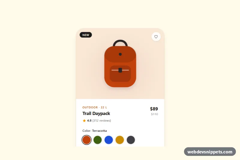
A Tailwind CSS product card with clickable color swatches, a size selector and an "Add to bag" button, built for e-commerce listings, quick-view panels and single-product landing pages. The illustrated backpack recolors itself live when a shopper picks a color, so the card shows exactly what they are about to buy.
How it works
The root is .tpv-card, an article labelled by the product name. The top area, .tpv-stage, holds an inline SVG (.tpv-product) whose main shapes use fill="currentColor". In style.css the SVG color and the tinted stage background both read the --tpv-color custom property, mixed with white through color-mix().
Colors are a fieldset of native radio buttons visually hidden with sr-only; each one carries its hex value in data-tpv-color. The visible circle is a sibling span styled with peer-checked: and peer-focus-visible: utilities, so selection and focus rings work without JavaScript. Sizes use the same pattern as rounded buttons; the sold-out XL radio is disabled and its label gets the diagonal strike from .tpv-soldout.
script.js initializes every .tpv-card on DOMContentLoaded. A change listener on the color radios writes the new value to --tpv-color, updates the data-tpv-color-name label and the SVG title. Clicking data-tpv-add checks for a chosen size: without one it reveals the data-tpv-error message and moves focus to the first available size; otherwise it writes a confirmation into the data-tpv-status region. The heart button (data-tpv-fav) flips aria-pressed, which the aria-pressed: and group-aria-pressed: variants use to fill the icon red.
Customization
--tpv-coloron.tpv-cardinstyle.css: sets the default product color before the script runs; keep it in sync with the checked swatch.data-tpv-colorandvalueon each color radio: change the hex code and name; also update the matchingbg-[#c2410c]utility on the swatch circle.- Add
disabledto any size radio and swap its span for the.tpv-soldoutstyling to mark it unavailable. grid-cols-4on the size grid: usegrid-cols-5orgrid-cols-3to match your number of sizes.rounded-[2rem]andmax-w-smon.tpv-card: change the corner radius or make the card wider.- Replace the SVG inside
.tpv-stagewith your own artwork that usescurrentColor, or with animgif you do not need live recoloring.
Accessibility
Both option groups are real radio buttons inside fieldset elements with a legend, so arrow keys move between options and screen readers announce the group and the selected value. Each swatch has a visually hidden color name, the sold-out size says "(sold out)", and the product SVG has role="img" with a title that follows the chosen color. The error uses role="alert", results are announced through role="status", and every control has a visible amber focus outline. Hover and color transitions are disabled under prefers-reduced-motion: reduce.
Usage notes
For several cards on one page, give each card unique radio name values (for example tpv-color-2) and unique id values for the heading and SVG title; the script already scopes everything to its own .tpv-card.