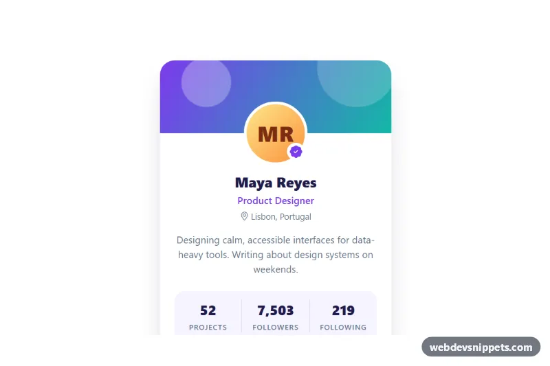
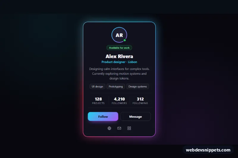
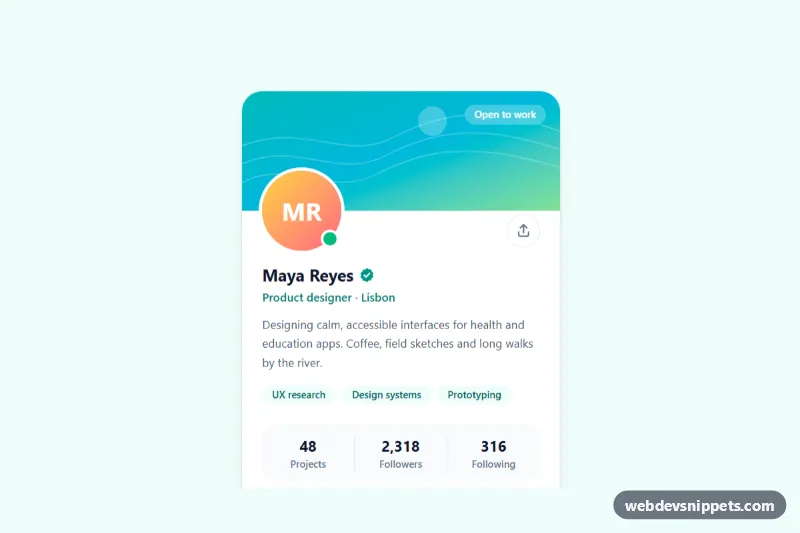
A Bootstrap 5 profile card with a violet-to-teal gradient cover, an initials avatar with a verified badge, three animated stat counters and Follow, Message and copy-link actions. Use it on community sites, author pages, team directories or as a user preview in a social app.
How it works
The card is an article.card.prs-card inside the .prs-wrap container, capped at 380px wide. The decorative .prs-cover band is drawn with layered gradients, and .prs-avatar is pulled up over it with a negative top margin calculated from --prs-avatar-size. The avatar shows initials (.prs-initials), so no photo is needed. The stats are a description list dl.prs-stats: each .prs-stat holds a dt label and a dd.prs-stat__value with a data-count attribute, and flex-direction: column-reverse shows the number above its label.
The script runs on DOMContentLoaded for every .prs-card. An IntersectionObserver waits until the card is visible, then countUp() animates each value from zero to its data-count with an ease-out curve over DURATION (1200 ms) and formats it with thousands separators. The numbers are already in the HTML, so the card is complete without JavaScript. Clicking .prs-follow toggles aria-pressed, swaps the icon and label to "Following", and adds or removes one follower on .prs-followers. The .prs-share button copies the page URL with the Clipboard API and falls back to showing the link if copying is blocked. Every action writes a short message into .prs-status.
Customization
--prs-fromand--prs-toin.prs-wrap: change the cover gradient;--prs-fromalso colors the role, the verified badge and the Follow button.--prs-avatar-sizein.prs-wrap: makes the avatar larger or smaller; the overlap and initials size follow automatically.data-counton a.prs-stat__value: sets the number the counter animates to, for exampledata-count="2048".DURATIONat the top ofscript.js: speed up or slow down the counter animation.- Replace the
.prs-initialsspan with animg(https://placehold.co/208x208) styledwidth: 100%; border-radius: 50%to show a photo. max-width: 380pxin.prs-card: widen the card for a sidebar or a profile page header.- The text in the
.prs-followclick handler: replace it with afetch()call to your own follow endpoint.
Accessibility
The card is labelled by the name heading through aria-labelledby. Decorative parts (cover, avatar, icons) are aria-hidden. The stats are a real description list, so screen readers announce label and value together. The Follow button exposes its state with aria-pressed, and the icon-only share button has an aria-label. .prs-status is a polite live region that announces follow and copy results. Buttons show a teal :focus-visible outline, and the counters skip the animation when prefers-reduced-motion: reduce is set.
Usage notes
Requires Bootstrap 5 (added automatically) and Bootstrap Icons. Repeat the article.prs-card in a row for a grid of profiles; each card animates and toggles independently. The Clipboard API needs a secure context, which is why the share button has a fallback message.