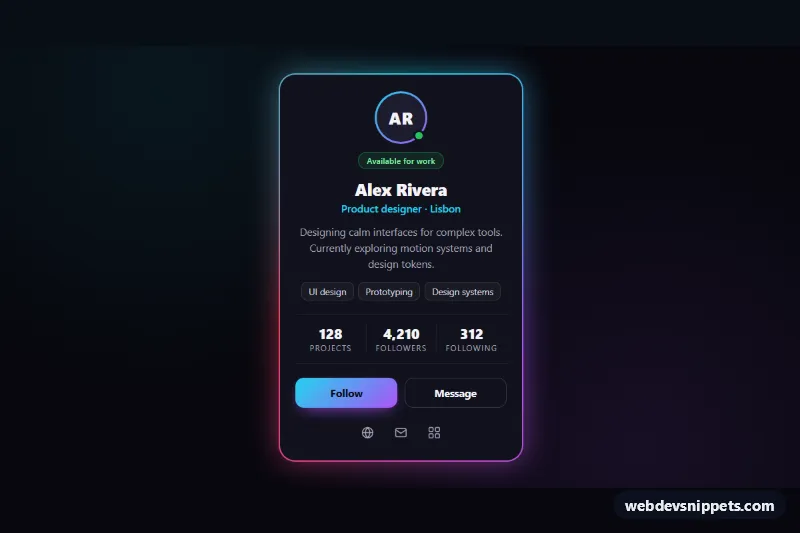
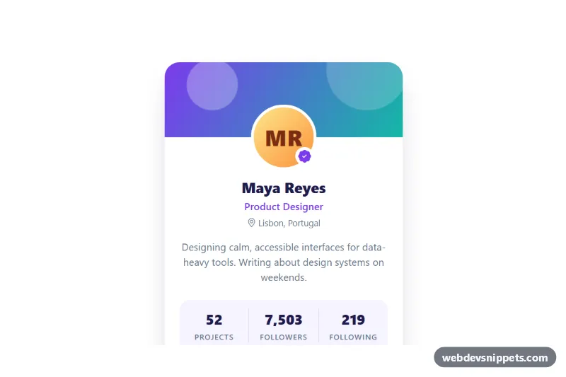
A user profile card with a cover banner, built with Tailwind CSS and a tiny vanilla JavaScript follow toggle. It combines a gradient cover, an overlapping avatar with an online indicator, a verified badge, a short bio, skill chips, a three-column stats row and Follow and Message actions. Use it for social apps, community directories, author boxes and team member pages.
How it works
The card is article.tpc-card, centered on a soft teal background. The .tpc-cover banner is a Tailwind gradient (from-teal-500 via-cyan-500 to-lime-300) with an inline SVG of wave lines on top; style.css enlarges its background-size and runs the slow tpc-drift animation. The avatar uses -mt-12 and ring-4 ring-white to overlap the cover edge. Initials sit on a gradient circle with role="img", so no image file is needed, and a green dot marks the person as online.
Stats are a dl in a three-column grid with divide-x separators; each dd is shown above its dt with flex-col-reverse. The followers value carries data-tpc-followers with the raw number.
On DOMContentLoaded the script initializes every .tpc-card. A click on the data-tpc-follow button flips aria-pressed, changes the data-tpc-label text between "Follow" and "Following", adds or subtracts one follower, formats the number with Intl.NumberFormat and replays the tpc-bump animation. The pressed style comes from Tailwind aria-pressed: variants, and style.css swaps .tpc-icon-plus for .tpc-icon-check. The comment at the end of the click handler marks where to add a fetch() call to your follow endpoint.
Customization
from-teal-500 via-cyan-500 to-lime-300on.tpc-cover: change the banner colors, or replace them with a background image utility for a photo cover.h-36on.tpc-coverand-mt-12on the avatar row: make the banner taller and adjust the overlap to match.from-amber-300 to-rose-400and theMRinitials: change the avatar, or swap thedivfor animgwithrounded-full.data-tpc-followerson.tpc-count: set the real follower count; the script formats it with thousand separators.bg-teal-600and thearia-pressed:utilities on.tpc-follow: restyle the default and following states.max-w-smon.tpc-card: widen the card for longer bios.animation: tpc-drift 12sinstyle.css: slow it down or remove it for a static cover.
Accessibility
The card is an article labelled by its h2. The Follow control is a native button with aria-pressed, so screen readers announce it as a toggle, and a polite data-tpc-status region confirms each change. The avatar and verified badge have text alternatives, the online dot has sr-only text, and the share icon link has a hidden label. Stats use a semantic description list. All controls have a visible focus-visible outline, text meets contrast guidelines, and every animation stops under prefers-reduced-motion: reduce.
Usage notes
Several cards can share a page because the script works per .tpc-card; give each copy a unique h2 id.