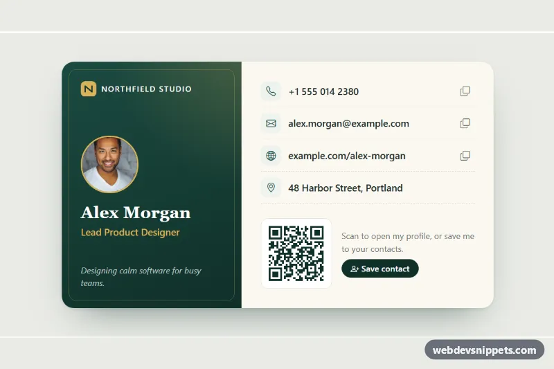
Business Card Style Contact Card
Bootstrap 5 digital business card with portrait, role, tap-to-call contact links, copy buttons, a QR code and a downloadable vCard.
User profiles, author boxes and contact cards.
4 component(s)
Bootstrap 5 digital business card with portrait, role, tap-to-call contact links, copy buttons, a QR code and a downloadable vCard.
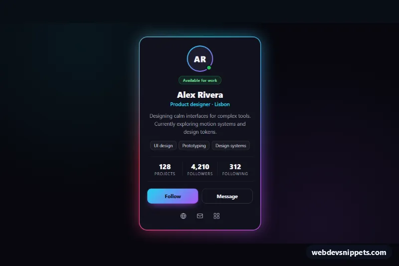
Dark profile card with an animated neon conic-gradient border, soft glow, stats, skill tags and a Follow toggle, built with pure CSS and vanilla JS.
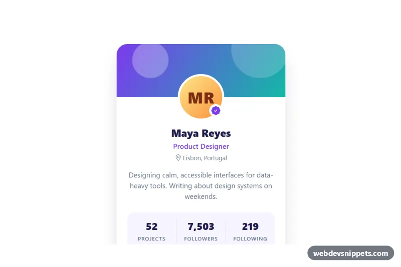
Bootstrap 5 user profile card with gradient cover, initials avatar, animated stat counters, follow toggle, message and copy-link buttons.
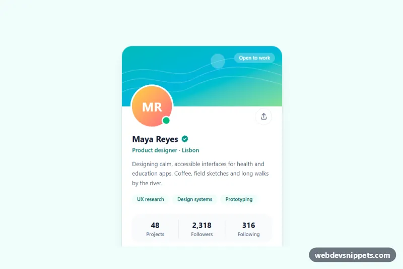
Tailwind CSS profile card with a gradient cover, overlapping avatar, verified badge, bio, skill chips, stats and an accessible follow toggle.
A profile card is a compact block that introduces a person: a photo or avatar, a name, a role or short bio, and usually a few actions such as follow, message or social links. You see them as author boxes under blog posts, as member tiles in community sites, as contact cards in CRMs and as user summaries on dashboards.
Unlike a generic card, a profile card has a fixed structure that users recognise instantly, so the layout matters more than decoration.
alt text, or an empty alt="" if the name is already printed next to it.aria-label such as "Follow on GitHub" so screen readers announce them.<button> for actions like follow or message, and a link for navigation to a profile page.loading="lazy" in long directories.Each responsive profile card example on this page comes with a live preview and code tabs, and you can filter by framework. The Bootstrap 6 versions use the new theme-* colour roles, so they follow your theme and dark mode automatically. Bootstrap 5 versions build on the familiar .card component, Tailwind CSS versions use utility classes for spacing and rounded avatars, and pure CSS versions work without any framework. Use the copy button or download the snippet, then swap in your own photos, names and links.