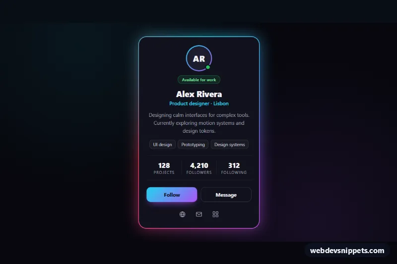
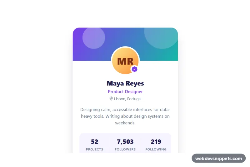
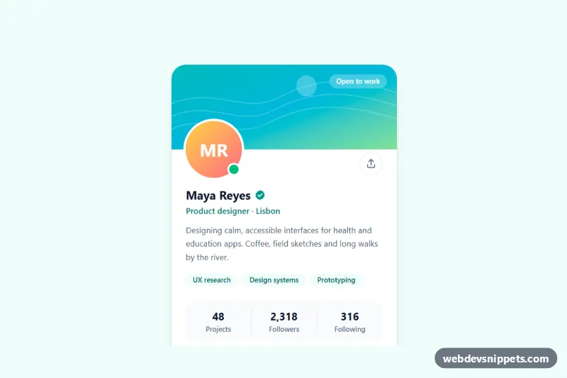
A dark profile card with a spinning neon gradient border and a soft glow, built with pure CSS and a tiny vanilla JavaScript follow toggle. Use it for team pages, creator profiles, author boxes, community directories or a personal landing page.
How it works
The wrapper .npc-stage provides the dark background and centers the article.npc-card. The card has a transparent border and two background layers: a solid --npc-surface color clipped to the padding-box, and a conic-gradient clipped to the border-box. Only the border area shows the gradient, which gives a crisp colored outline without extra wrapper elements.
The gradient starts at the angle --npc-angle, which is registered with @property as an <angle>. Because the browser knows its type, the npc-spin keyframes can animate it from 0deg to 360deg, so the colors travel around the border. The ::before pseudo-element repeats the same conic gradient behind the card with filter: blur(), creating the neon glow, and it brightens on :hover and :focus-within. In browsers without @property the border and glow still appear, just without rotation.
Inside the card are the .npc-avatar with initials and a status dot, a .npc-badge, the .npc-name and .npc-role, a short .npc-bio, a list of .npc-skills, a three-column dl.npc-stats block, the .npc-actions buttons and .npc-social icon links. The script listens for click on each .npc-follow button, flips aria-pressed, swaps the label between Follow and Following, and updates .npc-followers from its data-count value.
Customization
--npc-glow-1,--npc-glow-2and--npc-glow-3on.npc-stage: the three colors of the border, glow, avatar ring and primary button.--npc-spin: duration of one full rotation of the border; use10sfor a slower, calmer effect.--npc-blur: glow softness; larger values spread the light further around the card.--npc-border: thickness of the gradient border, for example3pxfor a bolder outline.--npc-surfaceand--npc-bg: card color and page background.--npc-radius: corner radius of the card and its glow.data-counton.npc-followers: the starting follower number used by the script.
Accessibility
The card is an article labelled by its name heading, and the stats use a description list so each number is read with its label. The Follow control is a real button with aria-pressed, so screen readers announce it as a toggle. Icon-only social links have an aria-label, and decorative SVGs and the avatar are aria-hidden. Buttons and links show a cyan focus outline. Text colors are chosen for strong contrast on the dark surface. With prefers-reduced-motion: reduce the border stops spinning and stays at a fixed angle.
Usage notes
Several cards can sit on one page, for example in a grid; each .npc-card is wired up on its own. Give every name heading a unique id.