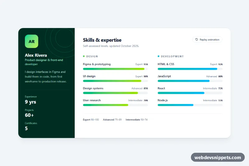
Animated skill progress bars built with Tailwind CSS and a small vanilla JavaScript file, presented as the skills section of a resume. A dark profile panel sits next to two groups of bars that fill up with a staggered animation and count their percentages up when the section scrolls into view, a common pattern for portfolios, CV websites and freelancer landing pages.
How it works
The root is section.tsp-skills. Inside a rounded card, the aside holds the monogram, name, short bio and a dl with three stats; on large screens the card switches to a two-column grid (lg:grid-cols-[17rem_1fr]). The right side contains two groups, Design and Development, each a labeled list of skills.
Every bar is a track with role="meter" and the values in aria-valuenow, aria-valuetext and aria-labelledby. The colored fill is .tsp-fill, and its length is a plain Tailwind width such as w-[95%]. Without JavaScript the bars are therefore already at their final size.
When the script runs, it adds tsp-armed to the root, which hides each fill with clip-path: inset(0 100% 0 0 round 999px), and sets the numbers in [data-tsp-number] to 0%. An IntersectionObserver waits until a quarter of the section is visible, then adds tsp-in-view: every fill reveals from left to right, and each bar gets its own --tsp-index so the delays are staggered. A requestAnimationFrame loop counts the numbers up with the same easing, and after the last bar the tsp-done class locks in the final state. The "Replay animation" button (data-tsp-replay) resets and plays everything again.
Customization
aria-valuenow,aria-valuetext, thew-[95%]class on.tsp-filland the number in[data-tsp-number]: change these together to set a skill level.from-emerald-500 to-lime-400andfrom-teal-500 to-sky-400on the fills: pick your own gradient for each group, or use a solidbg-*color.--tsp-durationinstyle.css: make the fill animation faster or slower; the counting numbers follow automatically.--tsp-staggerinstyle.css: set the delay between bars, or0msto fill them all at once.h-2.5on the meter track: useh-4for chunkier bars.bg-emerald-950on theaside: change the profile panel color, or remove theasideand thelg:grid-cols-*class to use the bars on their own.threshold: 0.25inscript.js: start the animation earlier or later while scrolling.
Use cases
- Resume websites: skill levels fill up and count their percentages when scrolled into view
- Freelancer portfolios: group design and development skills beside a profile panel
- CV pages: each bar shows a level label such as Advanced for screen readers and visitors
- Personal sites: a replay button restarts the staggered animation
- Job applications: display experience stats in a dark panel next to the bars
Accessibility
Skill levels are static values, not task progress, so each bar uses role="meter", labeled by its skill name, with aria-valuetext such as "80%, Advanced" so screen readers announce both the number and the level. The real values never change during the animation, only the visuals. The monogram and decorative circles are aria-hidden, the stats use a description list, and the replay button has a visible focus ring. Under prefers-reduced-motion: reduce the script skips the animation, hides the replay button and shows the final bars immediately.
Usage notes
Several instances can share a page: each .tsp-skills gets its own observer, but give the tsp-skill-* label ids unique values.