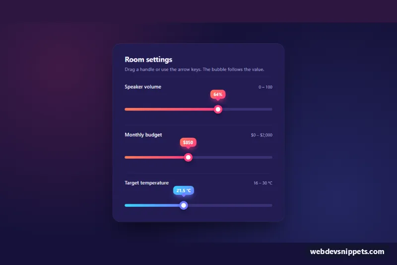
A custom range slider built on the native <input type="range">, with a gradient fill, a large ring-style thumb and a value bubble that follows the handle. It is written in pure CSS with a few lines of vanilla JavaScript and suits settings panels, price filters, volume controls and thermostat screens.
How it works
The root section.rs-panel holds a dark card (.rs-card) with three .rs-field blocks. Each field contains a label row and a .rs-track-wrap with an <output class="rs-bubble"> and the input.rs-input. Because the slider stays a real range input, it keeps native keyboard support, form submission and touch dragging.
The CSS removes the default appearance and restyles the parts with ::-webkit-slider-runnable-track, ::-webkit-slider-thumb, ::-moz-range-track, ::-moz-range-progress and ::-moz-range-thumb. Everything is driven by one custom property, --rs-pct (0 to 100). The WebKit track paints the gradient up to that point, and the bubble uses the same formula for its left position, calc(var(--rs-pct) * 1% + (0.5 - var(--rs-pct) / 100) * var(--rs-thumb)), so it stays centered over the thumb at both ends. Firefox fills the track natively with ::-moz-range-progress.
On DOMContentLoaded the script finds every .rs-field inside each .rs-panel. On input and change it calculates the percentage from min, max and value, writes --rs-pct on the field, formats the number with Intl.NumberFormat (decimal places follow the step attribute) and puts the text into the bubble and aria-valuetext.
Customization
--rs-accentand--rs-accent-2on.rs-panel: the two colors of the track fill, the bubble gradient and the thumb ring..rs-field--cool: a modifier that overrides the accent pair with cyan and indigo, as on the temperature slider. Copy the idea to create more color variants.--rs-thumband--rs-track-h: thumb diameter and track thickness; the bubble position adapts automatically.data-prefixanddata-suffixon.rs-input: text around the value, e.g.data-prefix="$"ordata-suffix=" °C".min,max,stepandvalueon.rs-input: astepof0.5shows one decimal place in the bubble.--rs-card,--rs-bgand--rs-track: card, page and empty track colors for a lighter theme.
Use cases
- Settings panels: a gradient fill and value bubble show the chosen level as users drag
- Price filters: the bubble shows a prefixed amount like a dollar value above the handle
- Volume controls: a large ring thumb is easy to grab on touch screens
- Thermostat screens: a cooler color variant with a suffix shows temperatures in degrees
Accessibility
Each slider has a visible <label for>, and the <output> is linked to its input with for. The script sets aria-valuetext so screen readers announce "$850" or "21.5 °C" instead of a bare number. Arrow keys, Page Up/Down, Home and End work natively. The thumb shows a double focus ring on :focus-visible, and the bubble lifts slightly while the field is focused. With prefers-reduced-motion: reduce the scale and lift transitions are turned off.
Usage notes
Without JavaScript the sliders still work, but the bubble and fill stay at their default position. Add more sliders by copying a .rs-field block with a unique id.