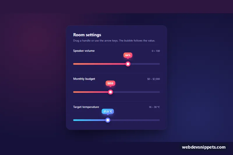
Custom Range Slider
Styled range input with a gradient fill, ring thumb and a live value bubble that follows the handle, in pure CSS and a few lines of vanilla JS.
Single and dual-handle range inputs.
2 components
Styled range input with a gradient fill, ring thumb and a live value bubble that follows the handle, in pure CSS and a few lines of vanilla JS.
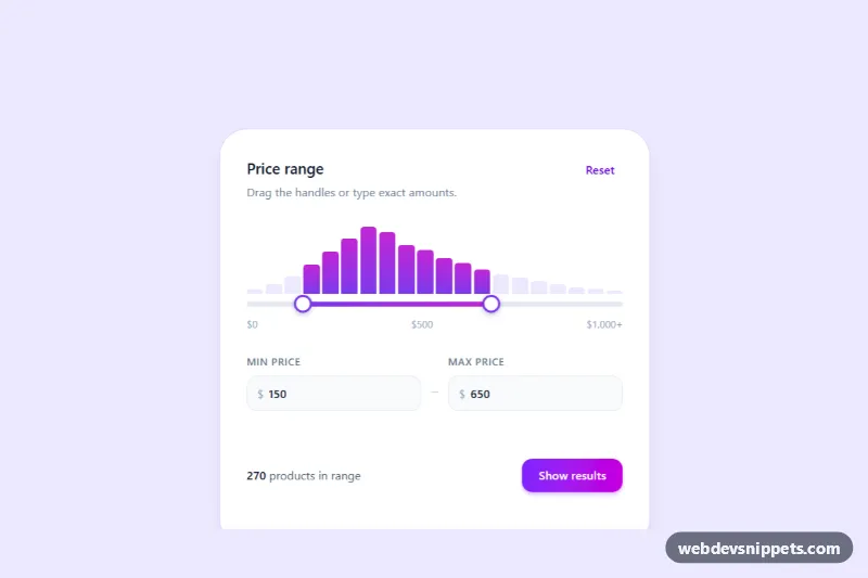
Tailwind CSS min/max price slider with two handles, synced number inputs and a live histogram that counts products in the selected range.
A range slider lets users pick a value, or a range of values, by dragging a handle along a track. Single-handle sliders suit volume, opacity or a maximum distance. Dual-handle sliders let users set a minimum and maximum, which is common for price filters in online stores, budget selectors and date or age ranges.
<input type="range">; it is keyboard accessible and works with assistive technology.aria-valuetext, for example "50 euros" instead of "50".::-webkit-slider-thumb and ::-moz-range-thumb, and keep a visible focus style.step values that make sense for the data, and show tick marks for important points if needed.This category includes custom range slider CSS, sliders with value bubbles, dual-handle price filters and stepped sliders. Bootstrap 6 versions use theme-* colour roles for the filled track. Bootstrap 5 versions start from .form-range and add a little JavaScript for value labels and dual handles, Tailwind CSS versions combine utilities with small custom CSS for the thumb, and pure CSS versions style the native input directly. Preview them live, check the code tabs, and copy the HTML, CSS and JS into your filters or settings.