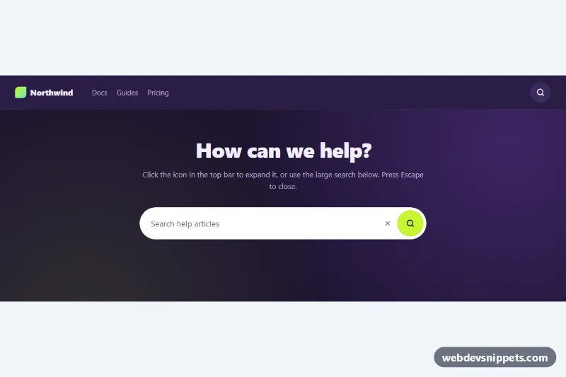
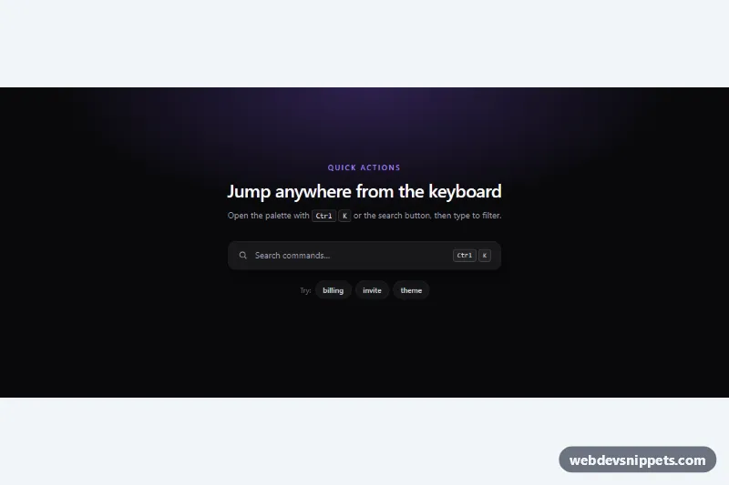
A Bootstrap 5 search bar with an autocomplete suggestion list that filters local data as you type, highlights the matching text and works fully with the keyboard. It fits help centers, documentation sites, dashboards and any page where users jump to a known item.
How it works
The root is section.sac-search. Inside the form.sac-form (with role="search"), .sac-field holds the search icon, the .sac-input text field, a .sac-clear button and the .sac-submit button. The suggestion popup .sac-popup is absolutely positioned under the field and contains the ul.sac-list listbox, a .sac-empty message and a row of keyboard hints.
The suggestions come from the ITEMS array at the top of script.js; each entry has a title, a category and a Bootstrap Icons class. On input the script waits for at least MIN_CHARS characters, ranks the entries (titles that start with the query first, then word starts, then any match, then category matches), keeps the first few and builds one .sac-option per result. The matching part of the title is wrapped in a mark element using text nodes only, so user input is never injected as HTML.
ArrowDown and ArrowUp move the active option (it wraps around), Enter picks it and Escape closes the list or clears the field. Clicking an option works too; a mousedown handler keeps focus in the input. Picking an option fills the field, writes a line into .sac-result and dispatches a bubbling sac:select event with the chosen item in event.detail. The .sac-chip buttons under the field fill in a popular query and open the list.
Customization
ITEMSinscript.js: replace the sample articles with your own pages, products or contacts.data-sac-limiton.sac-search: change how many suggestions are shown (default 6).MIN_CHARSinscript.js: set to 1 to suggest after the first keystroke.--sac-accent,--sac-accent-hoverand--sac-accent-rgbin.sac-search: recolor the button, focus border, chips and highlighted text.--sac-highlightin.sac-search: change the background of the active suggestion.--sac-radiusin.sac-search: make the field and popup rounder or square.max-heightin.sac-list: let the list grow taller before it scrolls.- The
submithandler inscript.js: replace the demo message with a redirect or afetch()to your search API.
Accessibility
The input follows the ARIA combobox pattern: role="combobox", aria-autocomplete="list", aria-expanded and aria-controls pointing at the role="listbox" list. The active option is announced through aria-activedescendant and aria-selected, so focus stays in the input. A visually hidden .sac-status live region reports how many suggestions are available, and the field has a real label plus a hidden hint. Buttons have visible focus outlines, and the popup animation is turned off with prefers-reduced-motion: reduce.
Usage notes
Requires Bootstrap 5 and Bootstrap Icons. Several instances can live on one page: the script adds a suffix to the IDs of every instance after the first. For large datasets, fetch suggestions from a server endpoint and debounce the input handler.