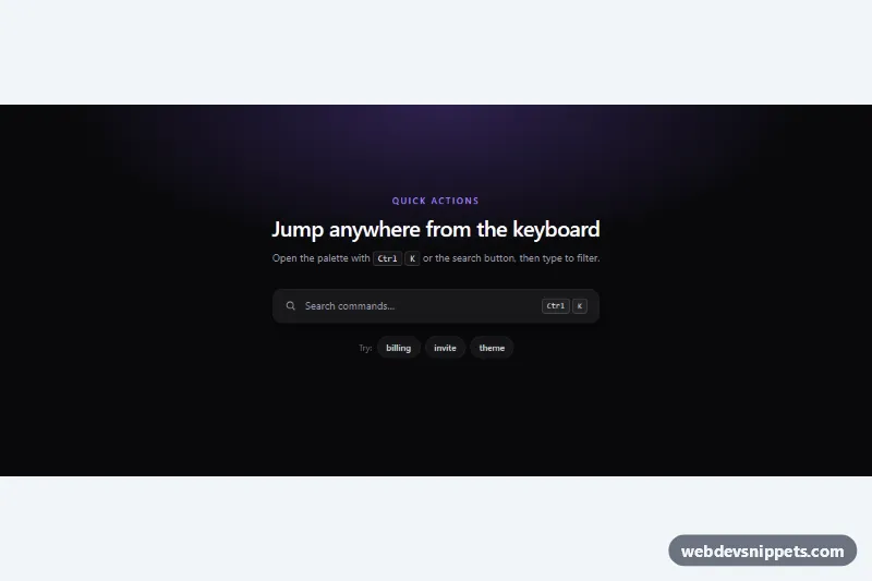
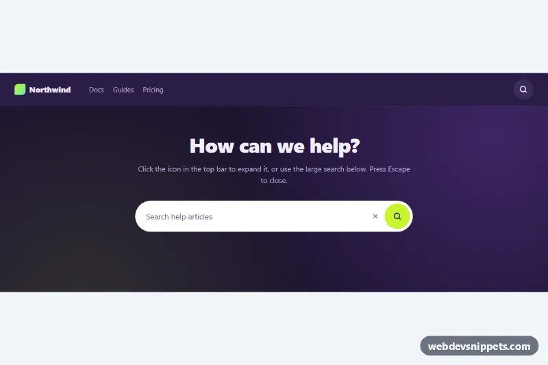
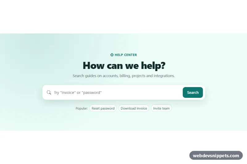
A dark command palette built with Tailwind CSS and vanilla JavaScript, opened with Ctrl + K (⌘ + K on macOS) or a search button. Users type to filter grouped commands, move through results with the arrow keys and press Enter to run one, the same pattern used in code editors, admin dashboards and SaaS apps.
How it works
The root is .tcp-palette. It holds the page content with a search button and suggestion chips marked data-tcp-open, a role="status" message (data-tcp-status) and the .tcp-overlay, which starts hidden. The overlay contains a blurred .tcp-backdrop and the #tcp-dialog panel (.tcp-panel). Inside the panel are the search input (data-tcp-input, role="combobox"), the #tcp-list listbox and a data-tcp-empty message.
Results are grouped: each data-tcp-group item contains a heading and a role="group" list of role="option" items marked data-tcp-option. Each option has a visible label (data-tcp-label) plus hidden search words in data-tcp-keywords, so typing "invoices" finds "Go to Billing".
On every input event the script splits the query into words and keeps only the options that contain all of them. Matching characters are wrapped in <mark class="tcp-mark">, empty groups are hidden and the empty state appears when nothing matches. The first visible result becomes active: it gets aria-selected="true" (styled with the aria-selected: variants) and its id is written to aria-activedescendant, so focus never leaves the input. Arrow Up and Down wrap through results, Ctrl + Home and Ctrl + End jump to the ends, mouse movement updates the active row and a click or Enter runs it. Running a command closes the palette, restores focus, shows a status message and dispatches a tcp:run event.
Customization
data-tcp-hotkey="k"on.tcp-palette: change the shortcut letter, or remove the attribute to disable the global shortcut.- Add a command by copying an
liwithrole="option"anddata-tcp-option; give it a uniqueid, adata-tcp-labeltext and search words indata-tcp-keywords. - Listen for
tcp:runon.tcp-paletteand useevent.detail.idorevent.detail.commandto navigate or call your own functions. aria-selected:bg-violet-500/15on the options and.tcp-markinstyle.css: change the active row and match colors.data-tcp-queryon anydata-tcp-openbutton: opens the palette pre-filled with that search, like the "billing" and "theme" chips.max-h-80on#tcp-list: show more or fewer rows before the list scrolls.pt-[10vh] sm:pt-[14vh]on.tcp-overlay: move the panel up or down on the screen.
Accessibility
The input follows the combobox pattern: role="combobox", aria-controls="tcp-list", aria-autocomplete="list", aria-expanded and aria-activedescendant. The panel is a role="dialog" with aria-modal="true", Escape closes it, Tab keeps focus on the search field and focus returns to the trigger on close. A hidden live region announces how many commands match, decorative icons and key hints are aria-hidden, and entrance animations are disabled under prefers-reduced-motion: reduce.
Usage notes
Only one palette per page should carry data-tcp-hotkey; otherwise every instance would open on the same shortcut. Ctrl + K overrides the browser's search-bar shortcut while the page has focus.