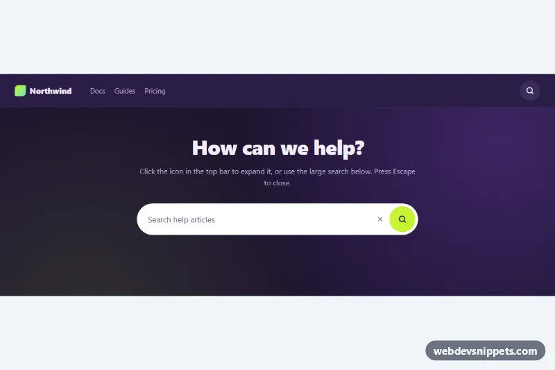
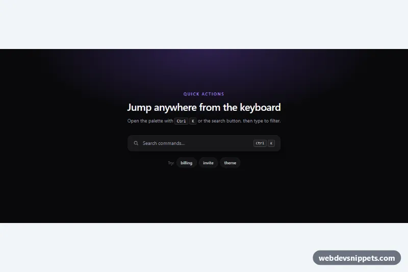
An expanding search bar built with CSS and a small vanilla JavaScript file: a round icon button that grows into a pill-shaped search field when clicked. The demo places one collapsed instance in a dark navbar and a large, already open instance in a help-center hero. Use it in headers, toolbars and documentation sites where space is tight.
How it works
Each instance is a form.xs-search with role="search". Inside are a visually hidden label (.xs-sr), the input.xs-input, a .xs-close button and the .xs-btn submit button with the magnifier icon, plus a .xs-status paragraph for messages. The form is a flex row, so when it sits at the end of the .xs-bar it grows to the left.
script.js loops over every .xs-search, adds .xs-ready and keeps aria-expanded and the button label in sync. The collapsed look only applies to .xs-search.xs-ready:not(.is-open): the input and close button shrink to width: 0, fade out and become visibility: hidden, so they cannot be tabbed to. The script listens to submit: if the form is collapsed it adds .is-open and focuses the input instead of submitting. Once open, a non-empty query shows a simulated message in .xs-status. Escape (keydown), the close button and a focusout with an empty field collapse it again. Without JavaScript .xs-ready is never added, so the field stays open and the form submits normally.
Customization
--xs-accenton.xs-demo: the lime color of the submit button and the focus ring.--xs-width: the expanded input width, e.g.20rem; the navbar uses9.5remon phones.--xs-size: the diameter of the round.xs-btnand the height of the field.--xs-speed: how fast the field expands and fades..xs-search--light: a white field with dark text;.xs-search--lgmakes a taller, full-width hero search.- Add
is-opento a.xs-searchin the HTML to render it expanded on load, as in the hero. - In the
submithandler inscript.js, replace thesetTimeoutdemo withfetch('/search?q=' + encodeURIComponent(query))or set a realactionand removepreventDefault().
Accessibility
Each form has role="search" and the input has a real label. The submit button announces "Open search" or "Submit search" and exposes aria-expanded and aria-controls, so screen reader users know the field is revealed. Focus moves into the input on open and back to the button on close. Results are announced through .xs-status, which has role="status". Buttons show a 3px focus outline and the open field shows an accent ring via :focus-within. Animations are turned off under prefers-reduced-motion: reduce.
Usage notes
Every .xs-search is independent, so you can place several on one page. Give each input a unique id that matches its label.