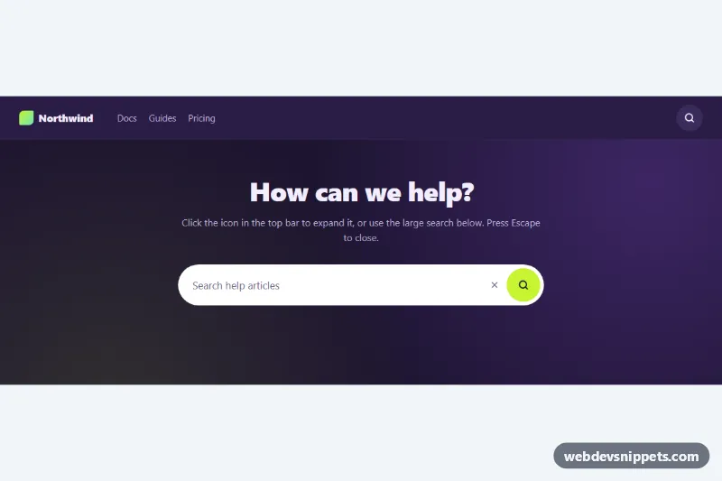
Expanding Search Bar
Search icon button that expands into a pill-shaped input, shown in a dark navbar and a large hero search, with Escape to close and a demo submit.
Search inputs with suggestions and filters.
3 components
Search icon button that expands into a pill-shaped input, shown in a dark navbar and a large hero search, with Escape to close and a demo submit.

Bootstrap 5 help center search bar with an accessible autocomplete list built from local data, highlighted matches, keyboard navigation and popular search chips.
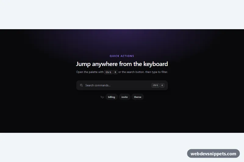
Dark Tailwind CSS command palette opened with Ctrl+K: live filtering with match highlights, grouped results and full keyboard navigation.
A search bar is an input that lets users find content, products or data. It ranges from a simple field with a search icon to rich components with autocomplete suggestions, recent searches, category scopes and filter chips. Search bars sit in navbars, hero sections, documentation sites, dashboards and above long tables and product lists.
<form role="search"> and use <input type="search"> with a visible or visually hidden label such as "Search products".aria-label.role="combobox", aria-expanded, aria-controls pointing to a role="listbox", and arrow keys to move through options.The search bar examples on this page include navbar search fields, hero search boxes, autocomplete dropdowns, search with category selects and filter bars. Bootstrap 6 versions use theme-* colour roles and ES module scripts for suggestions. Bootstrap 5 versions build on .form-control and .input-group, Tailwind CSS versions use focus ring and positioning utilities, and pure CSS versions keep things minimal. Preview each one live, copy the HTML, CSS and JS, and connect the input to your own search endpoint.