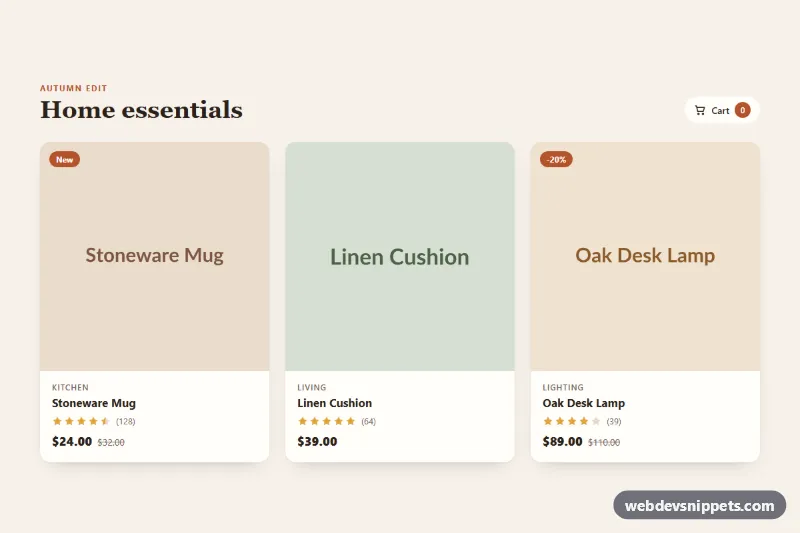
Product Card with Quick Actions
Responsive product card grid where hover or focus reveals wishlist, quick view and add-to-cart actions, with star ratings and a native quick view dialog.
Components tagged with "modal".
9 component(s)
Responsive product card grid where hover or focus reveals wishlist, quick view and add-to-cart actions, with star ratings and a native quick view dialog.

Accessible modal built on the native HTML dialog element with @starting-style enter and exit animation, blurred backdrop, mobile bottom sheet and an invite form.
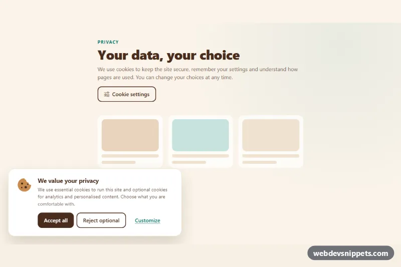
Bootstrap 5 cookie consent banner with a preferences modal: category switches, collapsible cookie tables, accept, reject and save actions, stored safely in localStorage.
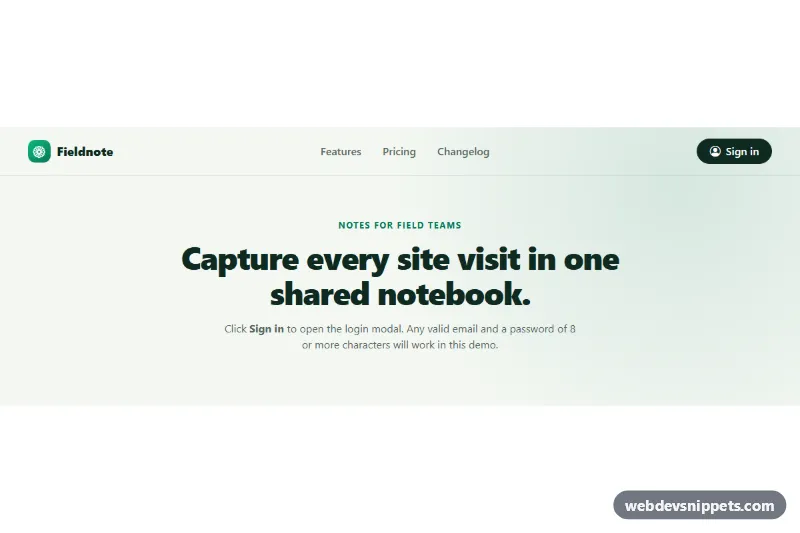
Bootstrap 5 login modal with social sign-in buttons, floating labels, a show/hide password toggle, client-side validation and a signed-in success view.
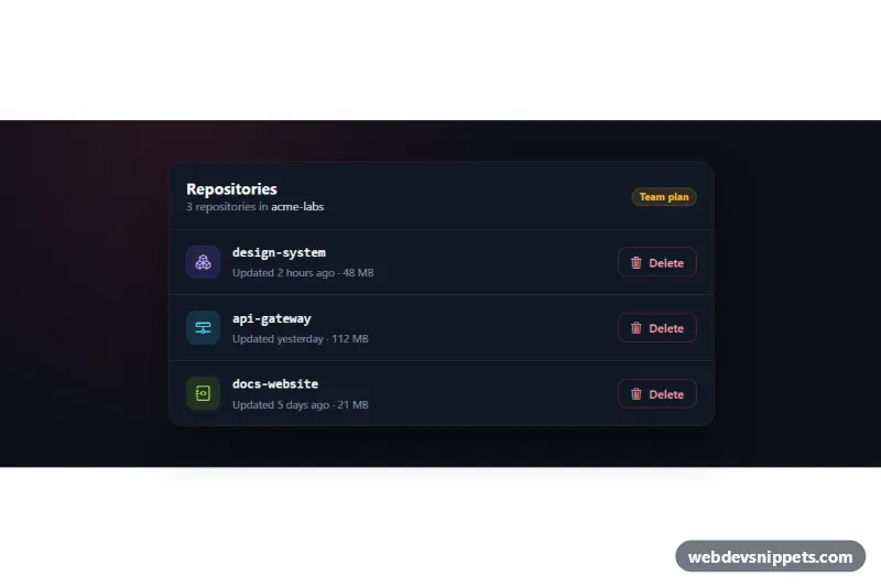
Dark Bootstrap 5 modal that confirms deleting an item by typing its exact name, with per-row triggers, a loading state and removal of the deleted row.
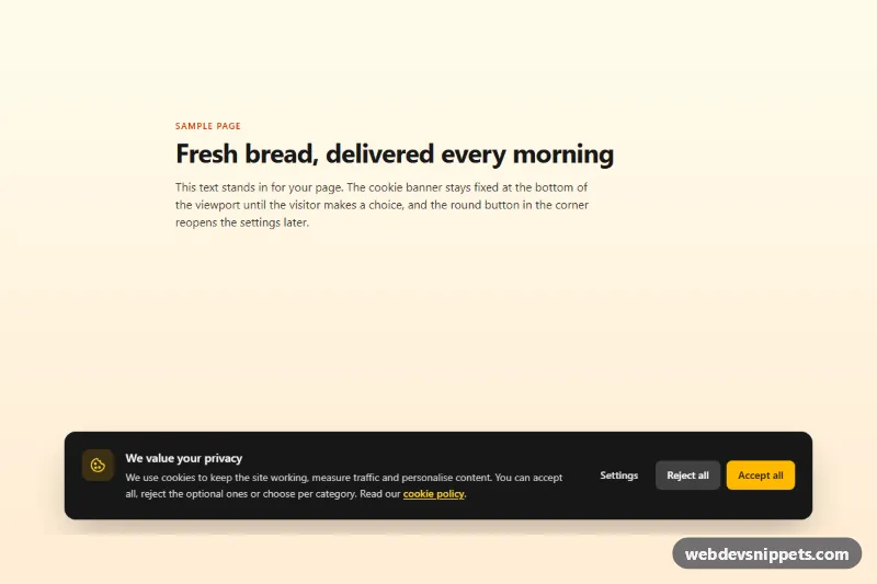
Tailwind CSS cookie consent banner with accept, reject and a settings dialog with category switches, saved to localStorage with a consent event.

Dark Tailwind CSS command palette opened with Ctrl+K: live filtering with match highlights, grouped results and full keyboard navigation.
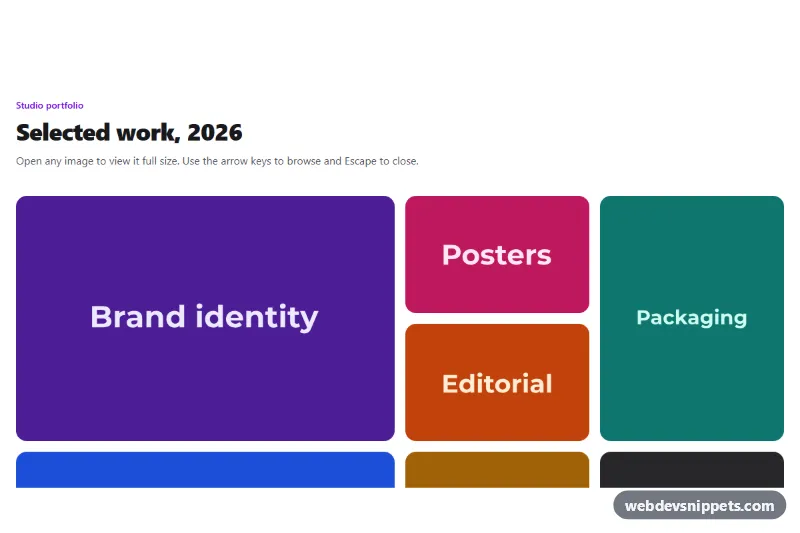
Tailwind CSS mosaic image gallery that opens an accessible lightbox with captions, arrow-key and swipe navigation, focus trap and preloading.
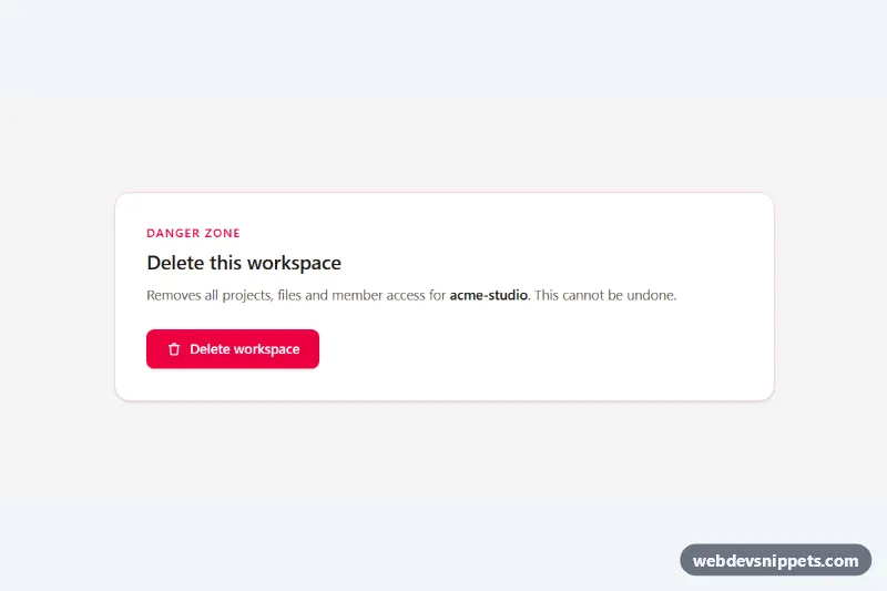
Accessible Tailwind CSS modal dialog with focus trap, Escape and backdrop close, scroll lock and a type-to-confirm delete action.