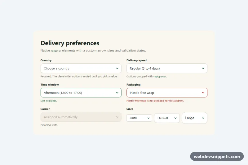
A set of native <select> elements restyled with pure CSS: a custom chevron arrow, a soft focus ring, error, success and disabled states, a muted placeholder and three sizes. Because the real select element stays in place, you keep the native option list, mobile pickers, form submission and keyboard behavior. Use it in checkout forms, settings pages and filters.
How it works
The root form.ns-panel holds a heading and an .ns-grid of .ns-group blocks, each with an .ns-label, an .ns-field wrapper and an .ns-help message. The .ns-select inside the wrapper uses appearance: none to remove the browser arrow, then gets its own border, radius, height and padding. The arrow is drawn by .ns-field::after from two borders rotated by 45 degrees, so its color comes from a custom property instead of a hard-coded SVG. pointer-events: none lets clicks pass through it to the select, and while the select has focus the arrow flips upward via .ns-field:focus-within::after.
States use plain selectors. .ns-select:required:invalid mutes the text while the empty placeholder option is chosen. [aria-invalid="true"] and :user-invalid turn the border red, and .ns-field:has(...) tints the arrow to match. .ns-field--valid shows the success color, and :disabled gives a dashed border with a not-allowed cursor. No JavaScript is needed.
Customization
--ns-accentand--ns-ringon.ns-panel: the focus border color and the translucent ring around a focused select.--ns-arrow: the default color of the chevron drawn by.ns-field::after.--ns-errorand--ns-success: border, arrow and help text colors for the error and valid states.--ns-radiusand--ns-height: corner radius and height of every select; set--ns-radius: 999pxfor pill-shaped fields..ns-field--smand.ns-field--lgon the wrapper: switch a field to the small or large size, which overrides--ns-height,--ns-font-sizeand--ns-radius..ns-field--validon the wrapper: shows the green success state, for example after server-side validation passes.grid-template-columnsin the.ns-gridmedia query: one column on phones, two from 640px.
Accessibility
Every select has a visible <label for> or an aria-label, and help or error text is connected with aria-describedby. The error state is announced through aria-invalid="true", not color alone, and the message text explains the problem. The focus ring appears on :focus-visible with a 4px halo that stays visible on the cream background. All keyboard behavior is native: arrow keys, type-ahead and Alt+Down to open the list. Transitions on the arrow and border are removed under prefers-reduced-motion: reduce.
Usage notes
The native dropdown list itself is drawn by the operating system, so only the closed control is styled. :has() and :user-invalid need a current browser; older ones simply keep the default arrow color and skip the late error styling.