
Multi-Select Dropdown with Checkboxes
Bootstrap 5 multi-select dropdown with checkboxes, live search, select all and clear, a selected count badge and removable chips.
Custom select boxes and multi-selects.
3 component(s)
Bootstrap 5 multi-select dropdown with checkboxes, live search, select all and clear, a selected count badge and removable chips.
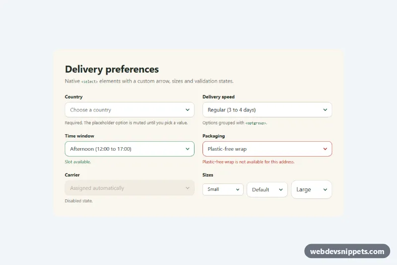
Pure CSS restyle of the native select element with a custom arrow, focus ring, error, success and disabled states, and three sizes.

Accessible Tailwind CSS combobox that filters options as you type, highlights matches and supports full keyboard navigation.
A select lets users choose one or more options from a list. The native <select> element is reliable and accessible, while custom select boxes add search, icons, grouped options, tags for multiple values and richer styling. This category covers styled native selects, searchable selects, multi-selects with chips and grouped option lists.
<select> whenever it does the job; it works with keyboards, screen readers and mobile pickers out of the box.appearance: none and a custom arrow, keeping a clear focus style.<label>.<optgroup> and order options logically, alphabetically or by frequency.aria-expanded, aria-activedescendant or roving focus, arrow key navigation, Enter to select and Escape to close.overflow: hidden, and that it fits on small screens.The custom select examples here include styled native selects, searchable dropdowns and multi-select boxes. Bootstrap 6 versions use theme-* colour roles and ship any script as an ES module. Bootstrap 5 versions start from .form-select and add small vanilla JavaScript where needed, Tailwind CSS versions use utility styling around native or custom elements, and pure CSS versions show how to restyle a native select without JavaScript. Preview each one, open the code tabs, and copy the HTML, CSS and JS into your form.