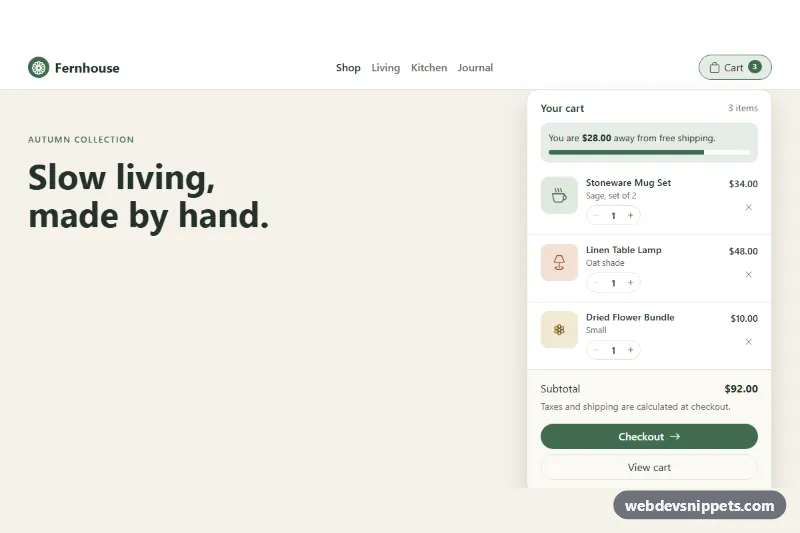
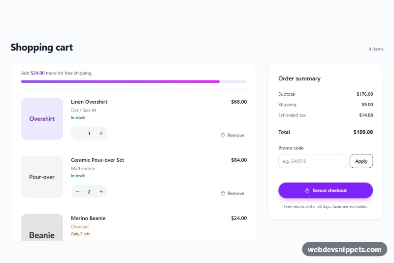
A Bootstrap 5 mini cart that opens from a pill-shaped cart button in the navbar and lists the products, quantity steppers, a free-shipping progress bar, the subtotal and Checkout / View cart buttons. Use it in online store headers where shoppers want a quick look at their cart without leaving the page.
How it works
The root is div.mc-shop, which holds a navbar and a sample hero. The cart sits in .dropdown.mc-cart outside the collapsing links, so it stays visible on phones. The .mc-cart__toggle button uses Bootstrap's dropdown with data-bs-auto-close="outside", so clicks on the quantity buttons do not close the menu, and data-bs-display="static" so the CSS places .mc-menu under the right edge of the button. Below 576px the menu stretches across the navbar.
Each product is an li.mc-item with data-price and data-qty. The script listens for clicks on .mc-list: buttons with data-mc-step="-1" or data-mc-step="1" change the quantity, and .mc-item__remove deletes the row. After every change render() recalculates the line prices, the .mc-badge count, .mc-menu__count, .mc-subtotal and the .mc-ship progress bar, formatting money with Intl.NumberFormat. When the last item is removed, .mc-empty appears and .mc-btn-checkout is disabled. The badge plays a short mc-bump animation on each change.
Customization
--mc-accent,--mc-accent-hoverand--mc-accent-softin.mc-shop: recolor the badge, checkout button, progress bar and hover states.--mc-menu-widthin.mc-shop: make the dropdown panel wider or narrower on larger screens.data-mc-free-shipping="120"on.mc-shop: change the free-shipping threshold; set it to0and remove.mc-shipto hide the progress bar.data-mc-currency="USD"on.mc-shop: switch toEUR,GBPor any ISO currency code for all prices.data-maxon an.mc-item: limit how many units of that product can be added (the default is 9).data-mc-autoshowon.mc-shop: opens the dropdown on page load for the demo; remove it so the cart starts closed.max-height: 19remin.mc-list: show more rows before the item list scrolls.- The
.mc-item__thumb--sage,--clayand--sandicon tiles: replace them withimgelements for real product photos.
Accessibility
The cart button has aria-expanded (managed by Bootstrap), aria-controls and an aria-label that the script keeps in sync, for example "Shopping cart, 4 items"; the visual badge is aria-hidden. Each stepper is a role="group" with a product-specific label, and the minus button is disabled at quantity 1. Changes are announced through the visually hidden .mc-status live region. When a row is removed, focus moves to the next remove button or to the cart heading, so keyboard users never lose their place. Bootstrap adds Escape and arrow-key support to the dropdown. Focus rings use --mc-accent, and the badge animation and progress transition are off with prefers-reduced-motion: reduce.
Usage notes
Requires Bootstrap 5 with its JS bundle and Bootstrap Icons. Replace the click handler logic with calls to your cart API and re-run the rendering after the response.