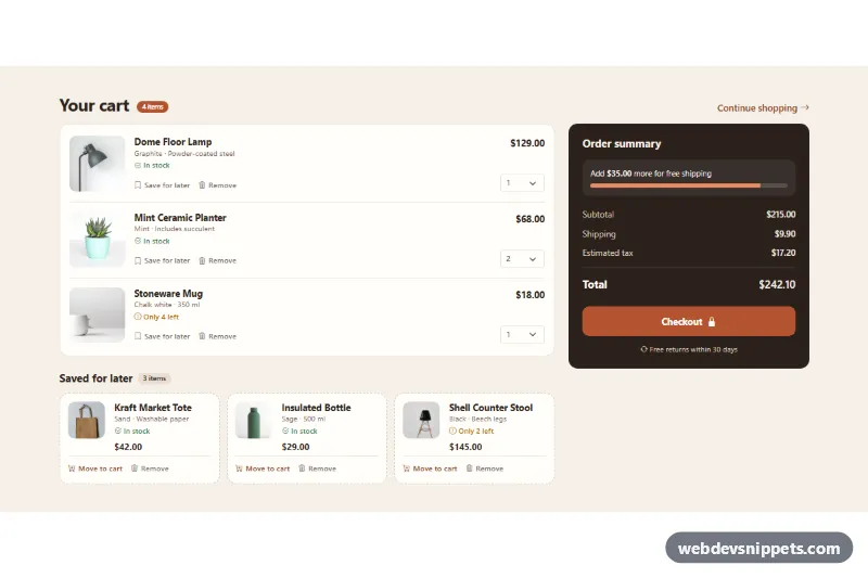
Cart with Saved for Later Section
Bootstrap 5 cart page with product photos, quantity selects, a saved for later list and a live order summary with free-shipping progress.
Cart pages, mini carts and cart drawers.
3 component(s)
Bootstrap 5 cart page with product photos, quantity selects, a saved for later list and a live order summary with free-shipping progress.
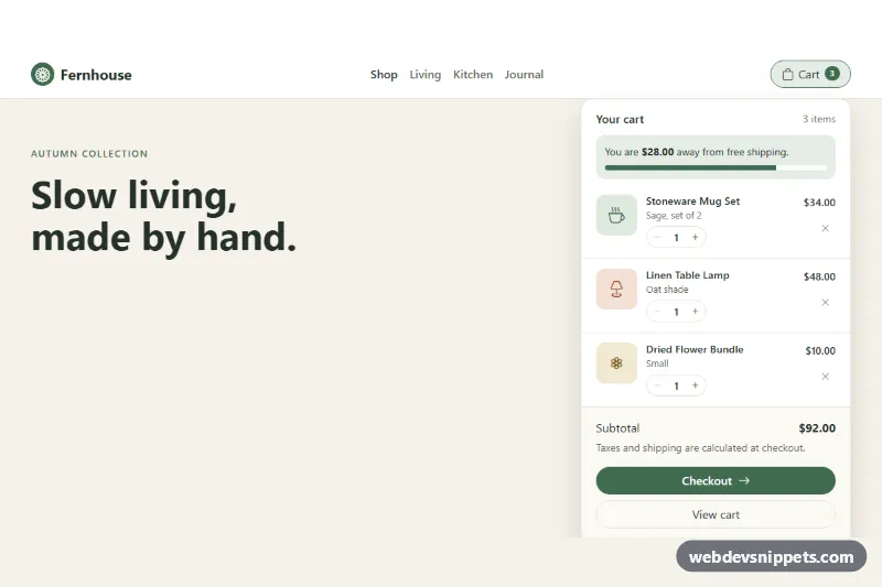
Bootstrap 5 navbar mini cart dropdown with quantity steppers, remove buttons, free-shipping progress, live subtotal and checkout button.
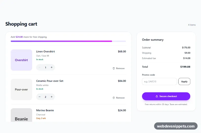
Tailwind CSS shopping cart with quantity steppers, remove buttons, free shipping progress bar, promo code field and a live-updating order summary.
A shopping cart component shows the items a customer has chosen before checkout. It comes in three common forms: a full cart page with a table or list of items and an order summary, a mini cart dropdown that opens from the cart icon in the header, and a cart drawer that slides in from the side after adding a product. Each version lists product images, names, variants, quantities, line prices, a subtotal and a button to continue to checkout.
Each quantity control needs a label that includes the product name, for example "Quantity for Linen Shirt", and remove buttons should say "Remove Linen Shirt" rather than just showing a cross. Announce total changes and removed items through a role="status" live region. A cart drawer should behave like a dialog with focus moved inside, Escape to close and focus returned to the cart button. The cart icon in the header should expose the item count in its accessible name.
These shopping cart HTML CSS examples and bootstrap cart page templates are available for Bootstrap 6, Bootstrap 5, Tailwind CSS and pure CSS. Bootstrap 6 cart drawers use the native <dialog> element. The included scripts only handle the interface, such as quantity buttons and totals; you connect them to your own cart backend. Try them in the live preview, then copy the code from the code tabs or download it.