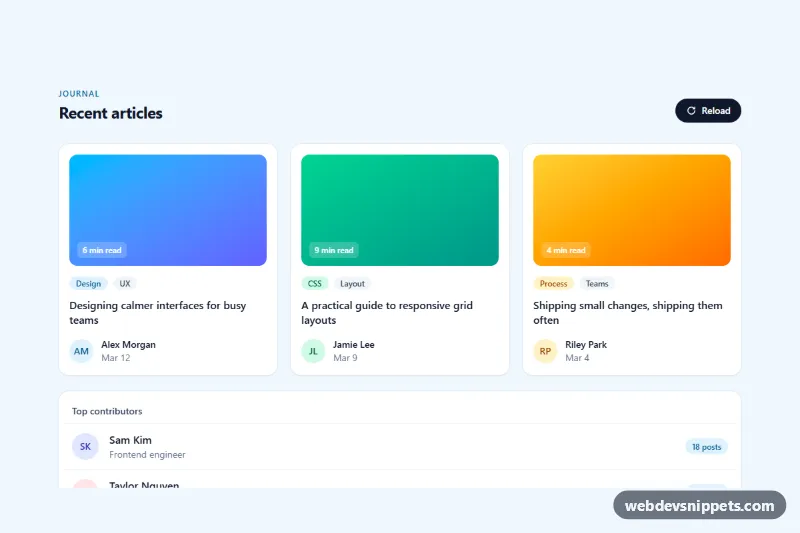
Skeleton loaders for cards and lists built with Tailwind CSS and a few lines of vanilla JavaScript. Gray placeholder shapes mirror the final layout of an article grid and a contributor list, pulse while data is loading and are then swapped for the real content. Use them on blogs, dashboards and feeds to reduce layout shift and make loading feel faster than a spinner.
How it works
The root is .tsk-root. Inside it, the data-tsk-region wrapper holds two states: data-tsk-skeleton with the placeholders and data-tsk-content with the finished cards, which starts hidden. Each placeholder card is a .tsk-card with Tailwind's animate-pulse, and every shape inside it is a .tsk-bone: an aspect-video block for the image, rounded pills for tags, bars of different widths for the title and a circle for the avatar. The bones use the same spacing and sizes as the real article elements, so nothing jumps when content arrives.
On DOMContentLoaded the script calls load(), which shows the skeleton, sets aria-busy="true" and disables the Reload button (data-tsk-reload). After data-tsk-delay milliseconds showContent() hides the skeleton, reveals the content (which fades in through .tsk-fade) and announces the result. Clicking Reload runs the cycle again.
Customization
data-tsk-delayon.tsk-root: change the simulated loading time in milliseconds.data-tsk-effect="shimmer"on.tsk-root: replace the pulse with a light sweep defined bytsk-shimmerinstyle.css.bg-slate-200on.tsk-bone: usebg-sky-100orbg-zinc-300for tinted or higher-contrast placeholders.sm:grid-cols-2 lg:grid-cols-3on both grids: change the column count, keeping skeleton and content in sync.load()inscript.js: replace thesetTimeoutwith afetch()call and build the cards before callingshowContent().- Copy a
.tsk-cardblock to add more placeholders, or delete the list card if you only need the grid.
Accessibility
The skeleton is decorative and marked aria-hidden="true", so screen readers never read out empty shapes. The region carries aria-busy while loading, and a visually hidden role="status" element announces "Loading articles" and "Articles loaded". The Reload button is disabled during loading and has a visible focus ring, as do the article links. Under prefers-reduced-motion: reduce the pulse, shimmer and fade-in are all turned off.
Usage notes
Without JavaScript the skeleton stays visible, so render the real content on the server when possible and use the skeleton only for client-side loading. For several instances on one page, give each .tsk-root its own heading id.