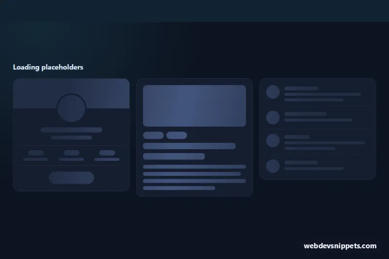
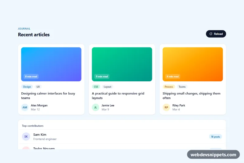
A shimmer skeleton screen in pure CSS with three dark placeholders: a profile card, an article card and a comment list. Show it while data loads to keep the layout stable and give users a sense of progress, then swap it for the real content.
How it works
The root section.sk-wrap holds .sk-grid with three article.sk-card elements: .sk-profile, .sk-article and .sk-list. Every grey shape is a .sk-bone, sized with helper classes: .sk-line with .sk-line--sm, --lg or --xl for height and .sk-w-30 to .sk-w-100 for width, plus .sk-avatar, .sk-pill, .sk-media, .sk-tag and .sk-profile__cover.
The shimmer is one gradient on .sk-bone: a soft highlight band painted over --sk-base, three times as wide as the viewport. The sk-shimmer keyframes move its background-position, and background-attachment: fixed places the gradient relative to the viewport instead of each element. As a result, one diagonal light sweep runs across all cards at the same time, rather than every bar shimmering on its own. A negative animation-delay starts the sweep in view on the first frame. No JavaScript is used.
Customization
--sk-baseand--sk-highlighton.sk-wrap: the placeholder color and the shimmer band color. Use#e5e9f0and#f5f7fafor a light theme.--sk-speed: duration of one sweep; lower values make the shimmer faster.--sk-radius: corner radius of lines and blocks..sk-w-30to.sk-w-100on a.sk-line: vary line widths so the text looks natural.heightin.sk-mediaand.sk-profile__cover: match the size of your real image so nothing jumps when content arrives.grid-template-columnsin.sk-grid: show one, two or three placeholders per row.
Accessibility
Each card has aria-busy="true" and a visually hidden .sk-sr paragraph with role="status", such as "Loading profile…", so screen reader users hear what is loading. The decorative bones are inside aria-hidden="true" containers. When the data is ready, replace the card and remove aria-busy. With prefers-reduced-motion: reduce the moving gradient is removed and the bones only fade gently with sk-breathe.
Usage notes
iOS Safari ignores background-attachment: fixed; there each bone simply shimmers on its own, which still looks fine. Copy only the placeholder cards you need and mirror the spacing of your real components.