
Skeleton Product Grid
Pure CSS skeleton loader for a product grid with shimmering placeholder cards, a wave-like sweep and an accessible loading status.
Content placeholders while data loads.
3 component(s)
Pure CSS skeleton loader for a product grid with shimmering placeholder cards, a wave-like sweep and an accessible loading status.

Dark pure CSS skeleton screen for a profile card, article and comment list, with one synchronized shimmer sweep across every placeholder.
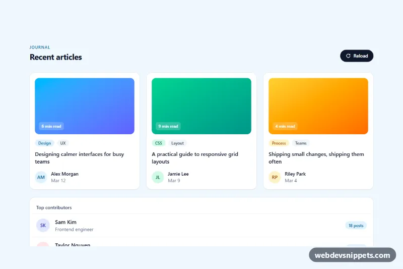
Tailwind CSS skeleton loaders for an article card grid and a list, with pulse or shimmer animation that swaps to real content once loaded.
A skeleton loader is a placeholder that mimics the layout of the content that is about to load: grey blocks where images will appear, rounded bars in place of text lines, circles for avatars. A subtle shimmer or pulse shows that loading is in progress. Skeleton screens are used in feeds, product grids, dashboards, profile pages and anywhere data comes from an API, because they make waiting feel shorter and prevent the layout from jumping when content arrives.
Hide the placeholder shapes from assistive technology with aria-hidden="true" and mark the container with aria-busy="true" while loading, plus a visually hidden "Loading" status message. Set aria-busy="false" once content is in place. Keep the shimmer gentle and turn it off under prefers-reduced-motion. Build the shimmer with a moving background gradient or a transform-animated pseudo-element; both are light and need no JavaScript. Make sure the skeleton colours are distinguishable in both light and dark themes.
These skeleton loader CSS snippets come in Bootstrap 6, Bootstrap 5, Tailwind CSS and pure CSS. Bootstrap 5 versions use the placeholder and placeholder-glow utilities; Bootstrap 6 versions follow the alpha markup and theme-* colour roles; Tailwind versions use animate-pulse. Compare them in the live preview, then copy the HTML and CSS from the code tabs or download them and shape the blocks to match your own cards and lists.