
Skeleton Product Grid
Pure CSS skeleton loader for a product grid with shimmering placeholder cards, a wave-like sweep and an accessible loading status.
Components tagged with "loader".
7 components
Pure CSS skeleton loader for a product grid with shimmering placeholder cards, a wave-like sweep and an accessible loading status.
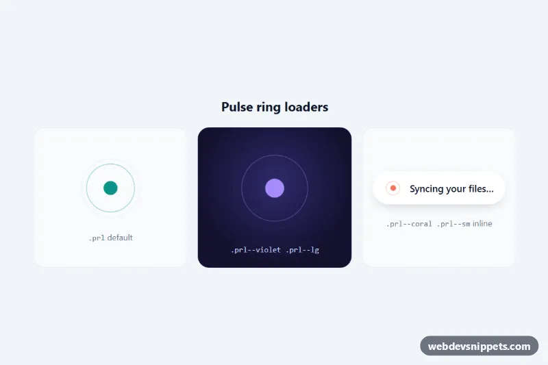
Pure CSS loading animation with concentric rings expanding from a beating dot, in default, large and inline sizes with custom properties and reduced motion.

Dark pure CSS skeleton screen for a profile card, article and comment list, with one synchronized shimmer sweep across every placeholder.
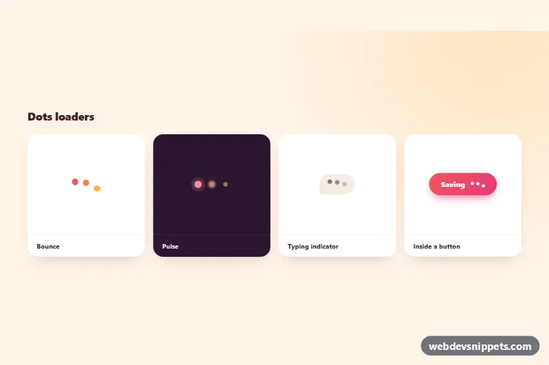
Pure CSS three-dot loaders: bounce, pulse with rings, chat typing indicator and a button loading state, all driven by custom properties.
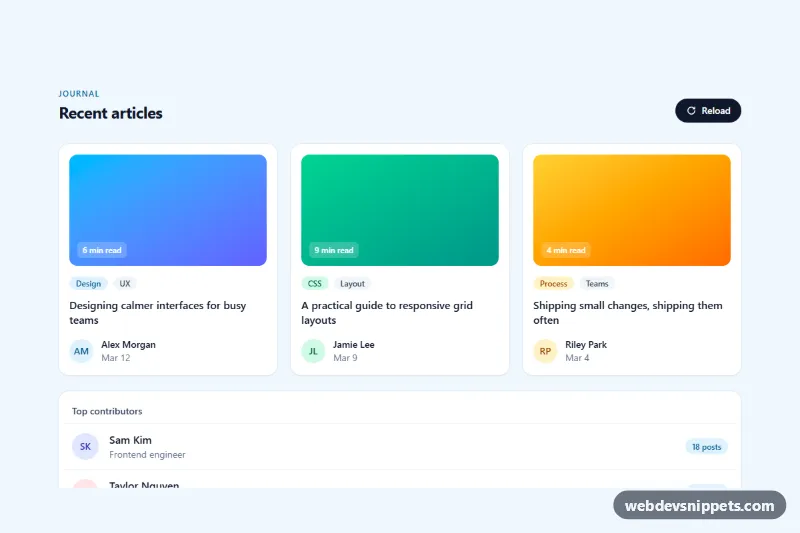
Tailwind CSS skeleton loaders for an article card grid and a list, with pulse or shimmer animation that swaps to real content once loaded.
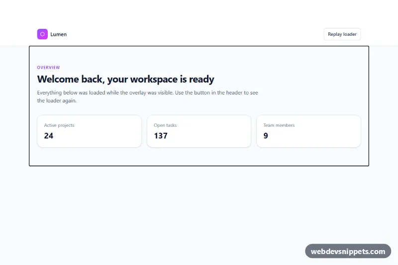
Tailwind CSS full-page loader overlay with a spinning gradient ring, progress bar and status messages that fades out once the page has loaded.
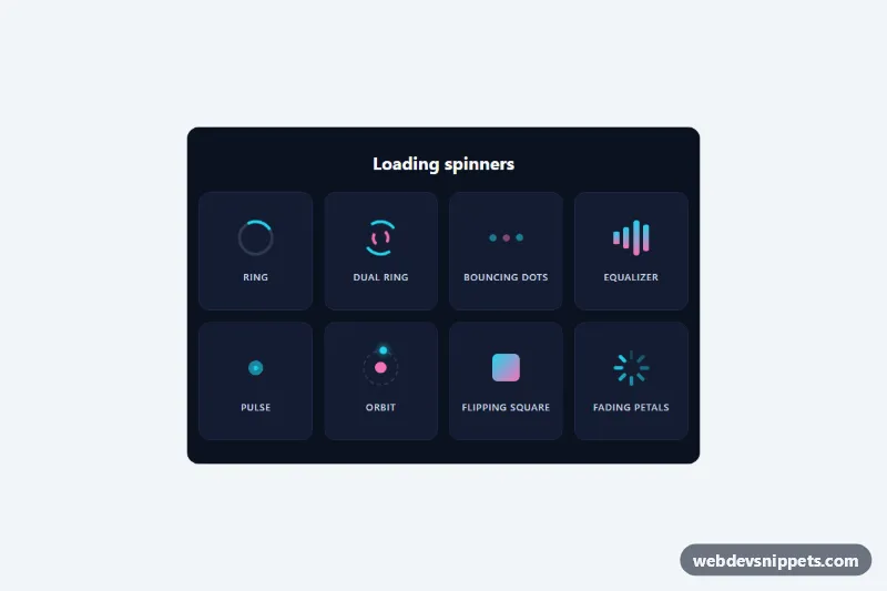
Eight lightweight pure CSS loading spinners in a labelled grid, each with role="status" and screen reader text, no JavaScript.