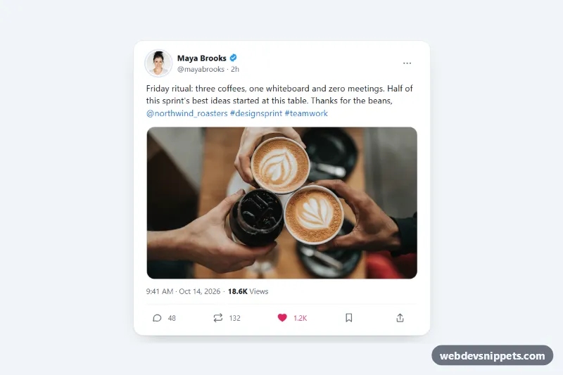
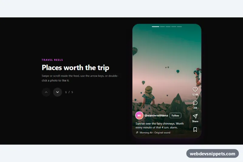
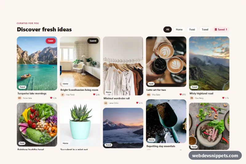
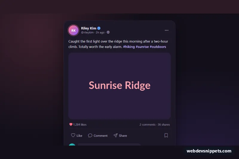
A microblog post card in the style of a social media timeline, with avatar, verified badge, post text, an attached photo, a views line and a row of action buttons. It is built with pure CSS and a short vanilla JavaScript file, and works well for embedded testimonials, social proof sections, social feed mockups and community pages.
How it works
The root article.tpc-card starts with a .tpc-head that contains the round .tpc-avatar, the .tpc-author block (.tpc-name, the inline SVG .tpc-verified badge, .tpc-handle and a relative time.tpc-ago) and a .tpc-more options button. Below it, .tpc-text holds the post with mention and hashtag links (.tpc-link), figure.tpc-media shows the photo in a fixed 16 / 9 box with object-fit: cover, and .tpc-meta shows the full date and the views count.
The .tpc-actions row has five buttons: reply, repost, like, bookmark and share. Each .tpc-action sets its own --tpc-tone, which colors the icon and its hover circle (color-mix() at 12%). Repost, like and bookmark are toggle buttons with aria-pressed. On click the script flips aria-pressed, adds or removes one from data-count, writes the short form ("1.2K") into .tpc-count and adds .is-popping for a small bounce. The share button tries navigator.clipboard and shows "Link copied to clipboard" in .tpc-status. Without JavaScript the card still renders fully; only the toggles do nothing.
Customization
--tpc-like,--tpc-repost,--tpc-replyand--tpc-saveon.tpc-card: the active and hover color of each action.--tpc-verified: color of the badge; delete thesvg.tpc-verifiedelement for accounts without one.--tpc-radiusand--tpc-media-radius: corner radius of the card and of the attached photo.aspect-ratioin.tpc-media: use1 / 1or4 / 5for square or portrait attachments.data-counton a.tpc-actionbutton: the starting number, also update the visible.tpc-counttext.aria-pressed="true"on.tpc-action--like: the like starts in its filled state, as in the demo. Set it tofalsefor a neutral card.--tpc-bg,--tpc-text,--tpc-mutedand--tpc-border: swap them for a dark mode card.
Use cases
- Testimonial sections: embed a customer post with avatar, verified badge and photo as social proof
- Social feed mockups: show a realistic timeline post with reply, repost, like, bookmark and share buttons
- Community pages: like and repost counters update with a short number format
- Landing pages: a post with an attached photo and views line adds credibility
- Prototypes: share copies a link and shows a status message
Accessibility
The card is an article labelled by the author name. All controls are real button elements with aria-label or a data-label that the script turns into a label with the current number, for example "Like, 1,208". Toggle state is exposed with aria-pressed. Bookmark and share feedback is announced through the role="status" region. Every interactive element has a visible :focus-visible outline, and action buttons are at least 44px tall. The verified badge is an svg with role="img" and a label, and decorative icons are hidden. Animations are removed with prefers-reduced-motion: reduce.
Usage notes
The avatar and the attached photo come from Unsplash; replace them with your own images. When you render several cards, give each one a unique id for the author link and its aria-labelledby. The counters are local only; add a fetch() call where the script comment marks the spot to save likes and reposts.