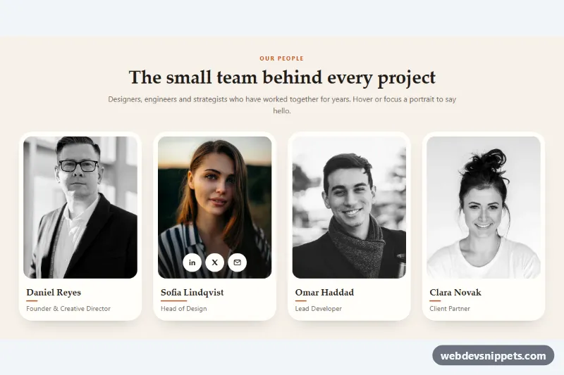
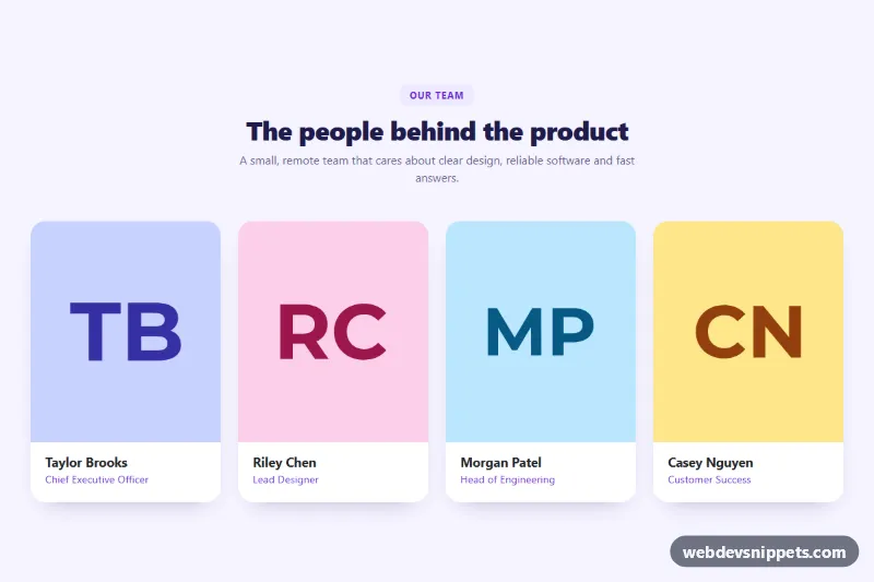
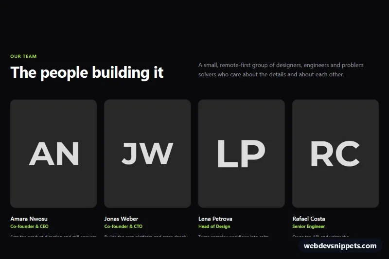
A swipeable team member carousel built with Tailwind CSS and a small vanilla JavaScript controller. Tall portrait cards show each person's photo with their name, role and city, making it a good fit for About pages, agency sites and startup landing pages that want to introduce a growing team without a long grid.
How it works
The root is .tpc-carousel. The slides live in ul.tpc-track, a horizontal flex row with overflow-x-auto and CSS scroll snapping (snap-x snap-mandatory on the track, snap-start on each .tpc-slide). Because it relies on native scrolling, the carousel already swipes on touch devices and works without JavaScript. Each slide is a figure with a 4:5 photo and a gradient figcaption; the photo zooms slightly on hover.
The slide width is calculated in style.css from two custom properties, --tpc-gap and --tpc-per-view, which change at the 640px and 1024px breakpoints. On phones the next card peeks in from the right, hinting that the row scrolls.
The script initializes every .tpc-carousel on DOMContentLoaded. The data-tpc-prev and data-tpc-next buttons scroll by exactly one slide, and they are disabled at either end. A scroll listener, throttled with requestAnimationFrame, updates the width of the data-tpc-progress bar, and once scrolling settles it writes the visible range ("1–4 of 7") into data-tpc-counter. With a mouse you can also drag the track: the tpc-is-dragging class turns off snapping while dragging, and the track snaps to the nearest slide on release.
Customization
--tpc-per-viewinstyle.css: set how many cards are visible per breakpoint, e.g.3instead of4on desktop for larger portraits.--tpc-gapon.tpc-carousel: widen or tighten the space between cards.aspect-[4/5]on eachfigure: useaspect-squareoraspect-[3/4]for a different portrait crop.bg-[#f6f1e9]on.tpc-carouseland theteal-700utilities on the buttons anddata-tpc-progress: switch to your brand background and accent color.from-stone-950/85in eachfigcaption: lower the opacity for a lighter caption gradient on bright photos.- Remove the city pill (the last
pin eachfigcaption) or replace it with social links for a shorter card.
The photos come from Unsplash and are placeholders; replace them with your own team portraits and keep the width, height and alt attributes up to date.
Use cases
- About pages: introduce a growing team with tall portrait cards showing name, role and city
- Agency websites: visitors swipe or drag through staff photos without a long grid
- Startup landing pages: arrow buttons and a progress bar show how many team members there are
- Mobile layouts: the next card peeks in from the right to hint that the row scrolls
- Company sites: native scroll snapping works on touch devices even without JavaScript
Accessibility
The section uses aria-roledescription="carousel" and each slide is a role="group" with aria-roledescription="slide" and a position label such as "3 of 7". The track itself is focusable, has an accessible name and responds to the Left and Right arrow keys, Home and End. The arrow buttons have visually hidden labels, aria-controls and a real disabled state. The counter is a polite live region updated only after scrolling stops. Every photo has descriptive alt text, all controls show a teal focus ring, and smooth scrolling, the hover zoom and the progress transition are disabled under prefers-reduced-motion.
Usage notes
For several carousels on one page, give each ul.tpc-track a unique id and update the matching aria-controls values.