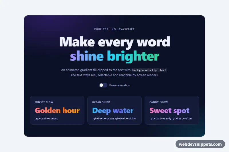
Animated gradient text in pure CSS, with no JavaScript at all. A colorful gradient flows through the letters of a heading, with palette presets, a light-sweep "shine" variant and a CSS-only pause switch. Use it for hero headlines, product names, section titles and launch pages.
How it works
The root section.gt-showcase contains a .gt-hero with the main headline and a .gt-grid of three .gt-card examples. The effect lives on a single class: any element with .gt-text gets background-image: var(--gt-gradient), a background twice as wide as the text, and background-clip: text with a transparent text fill, so the gradient is only visible through the letters. The gt-flow keyframes move background-position from 0% to 200%, which shifts the repeating gradient by exactly one tile. Because each palette starts and ends with the same color, the loop has no visible jump.
Palette modifiers such as .gt-text--aurora, .gt-text--sunset, .gt-text--ocean and .gt-text--candy only set --gt-gradient and a solid --gt-fallback color. .gt-text--shine adds a white highlight layer on top of the gradient and animates both layers with the gt-shine keyframes. .gt-text--slow doubles the duration. The pause switch is a visually hidden checkbox; the rule .gt-showcase:has(.gt-toggle-input:checked) sets animation-play-state: paused on every gradient text inside the section.
All gradient rules sit inside @supports for background-clip: text, so older browsers show the readable fallback color instead of invisible text.
Customization
--gt-speedon.gt-showcase: the duration of one loop, e.g.3sfor faster movement.--gt-angle: the gradient direction; try135degfor a diagonal flow.--gt-gradientin a palette modifier: define your own brand colors, and repeat the first color at the end for a seamless loop.--gt-fallback: the solid color used wherebackground-clip: textis unsupported.- Add
.gt-text--shineto any.gt-textelement for the light sweep, or.gt-text--slowfor a calmer pace. --gt-bgand--gt-card: the page background and card color of the showcase.- Remove
.gt-toggleif you do not need the pause switch.
Accessibility
The text stays real text: it is selectable, searchable and read normally by screen readers. The gradients are chosen to stay bright on the dark navy background. The pause switch is a native checkbox inside a label, so it works with the keyboard and shows a focus outline on .gt-toggle-track. With prefers-reduced-motion: reduce the animation stops and a static gradient remains.
Usage notes
Use .gt-text on inline-block or block elements; the hero uses display: inline-block with a little bottom padding so descenders are not clipped. The :has() pause rule needs a current browser.