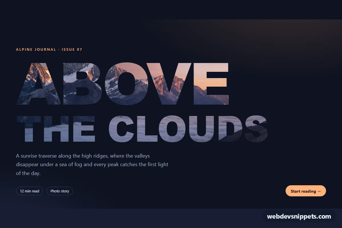
A huge editorial heading filled with a photograph instead of a flat color, built with pure CSS and background-clip: text. The mountain photo shows only through the letter shapes and drifts slowly inside them. Use it for magazine covers, travel landing pages, portfolio intros or any hero that needs a strong typographic statement.
How it works
The root section.ict-hero holds an eyebrow line, the heading .ict-title, a lead paragraph and a meta row with .ict-chip labels and a .ict-link call to action. The heading contains two .ict-fill spans: the large first line and a smaller second line marked .ict-fill--alt.
Each .ict-fill gets the photo from the --ict-photo custom property as its background-image. With background-clip: text (and the -webkit- prefixed version) the background is cut to the glyph shapes, and -webkit-text-fill-color: transparent removes the text color so the image becomes visible. A heavy display font, uppercase letters and tight line-height give the image as much surface as possible.
The ict-pan keyframes slowly change background-size and background-position, so the photo zooms and slides inside the letters. The second line runs the animation in reverse, which makes the two lines move against each other. Everything is wrapped in @supports; browsers without text clipping show the heading in the solid --ict-fallback color. No JavaScript is used.
The sample photo comes from Unsplash; replace it with your own image.
Customization
--ict-photoon.ict-hero: the image shown inside the letters. Pick a photo with strong contrast and detail.--ict-size: the font size of the first heading line;.ict-fill--altscales from it with0.62em.--ict-pan-duration: the length of one pan cycle; larger values make the movement calmer.--ict-fallback: the solid text color used whenbackground-clip: textis not supported.--ict-bg,--ict-accentand--ict-muted: the dark background, the peach accent of the eyebrow and button, and the lead text color.- Edit the
ict-pankeyframes to change the zoom range or the direction of the drift.
Use cases
- Magazine and editorial covers: a huge headline shows a mountain photo only through the letter shapes
- Travel landing pages: a slowly panning photo inside the heading sets the mood before any copy
- Portfolio intros: a bold typographic statement with an eyebrow line, lead paragraph and call to action
- Dark hero sections: the solid fallback color keeps the heading readable in browsers without text clipping
Accessibility
The heading stays real, selectable text, so screen readers and search engines read "Above the clouds" normally. The section is labelled by the heading through aria-labelledby. The fallback color keeps the text readable where clipping is unavailable, and the photo has dark mid-tones that contrast with the navy background. The link has a visible focus ring. With prefers-reduced-motion: reduce the pan animation and hover transitions are switched off.
Usage notes
Image clipped text works best for short words at very large sizes; long sentences lose the photographic effect. Keep the image size close to the displayed width to avoid loading a heavy file just for the letter shapes.