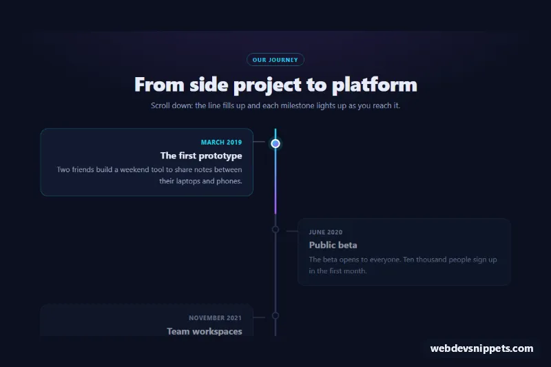
A dark vertical timeline in plain CSS and a small vanilla JavaScript file. A cyan-to-violet line fills from top to bottom as the visitor scrolls, and every milestone lights up the moment the line reaches its dot. Use it for company history, product roadmaps, release notes or project phases.
How it works
The root section.spt-timeline contains a header and a .spt-track. Inside the track, .spt-line is the gray rail and .spt-line-fill is the gradient bar on top of it. The fill is drawn with transform: scaleY(var(--spt-progress)) and transform-origin: top, so a single custom property between 0 and 1 controls how much of the line is colored. The milestones are an ordered list ol.spt-list; every li.spt-item has a .spt-dot and a .spt-card with a time.spt-date, a .spt-title and a .spt-text.
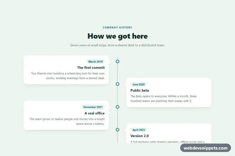
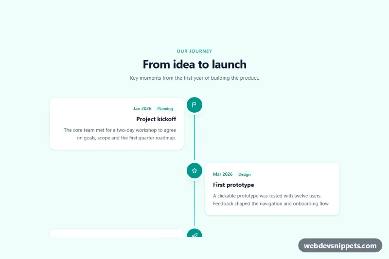
On phones the rail sits on the left and all cards stack to its right. From 768px the --spt-axis variable moves the rail to the center, odd items align right on the left side, even items move to the right, and a thin connector is drawn with .spt-card::after.
script.js adds .is-ready to each timeline and listens for scroll (passive), resize and load, batching work with requestAnimationFrame. It measures where the track crosses a trigger line in the viewport, writes the result to --spt-progress, and toggles .is-reached on every item whose dot is above that line. Items that are not reached yet are dimmed and shifted down slightly. At the very bottom of the page the trigger moves to the viewport edge, so the last milestone always lights up. Without JavaScript the line is full and every milestone is shown as reached.
Customization
data-spt-offseton.spt-timeline: where the trigger line sits, as a fraction of the viewport height;0.5reacts at the middle of the screen,0.8reacts earlier.--spt-fromand--spt-to: the two colors of the fill gradient, the reached dots and the dates.--spt-rail: the color of the empty rail and of dots that are not reached yet.--spt-line-widthand--spt-dot-size: the thickness of the line and the diameter of the dots.--spt-bgand--spt-surface: the page background and the card background.- The
768pxmedia query: change the breakpoint where the layout switches from one column to alternating cards. - Add or remove
li.spt-itemelements freely; the script measures them on every update.
Use cases
- Company history pages: milestones light up one by one as visitors scroll down the glowing line
- Product roadmaps: alternating cards show planned phases with dates in a clear vertical order
- Release notes and changelogs: each version is a dated card on a timeline that fills as you read
- Project case studies: phases of a project are told step by step along a line that follows the scroll
- About pages: a dark cyan-to-violet timeline gives a founding story a polished look on desktop and phones
Accessibility
The milestones are a real ordered list with time elements and datetime values, so assistive technology reads them in order with machine-readable dates. The line and dots are decorative and marked aria-hidden. Dimmed cards keep readable contrast, and no content is hidden. Fade transitions only start after the first user scroll, and with prefers-reduced-motion: reduce they are removed completely, while the line still follows the scroll position.
Usage notes
Several timelines can share a page; each one is measured on its own.