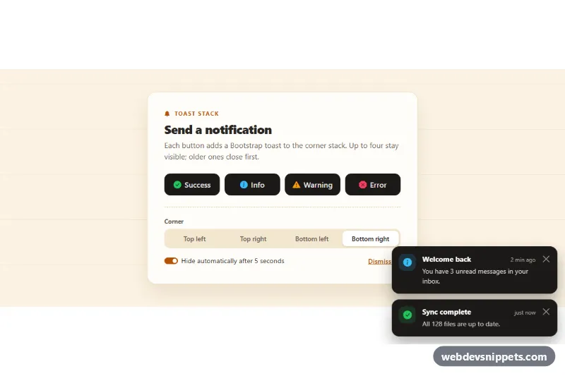
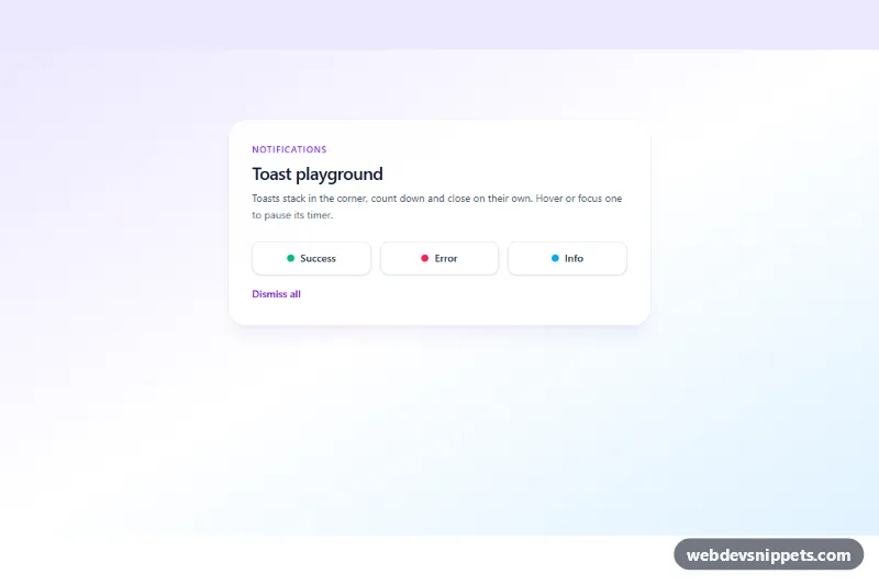
A Bootstrap 5 toast stack that collects notifications in one corner of the screen. Four buttons create success, info, warning and error toasts, a segmented control moves the stack to any corner, and timed toasts show a shrinking progress bar. Use it for save confirmations, upload errors and other short status messages in dashboards and web apps.
How it works
The root .tst-root contains a control panel (.tst-panel) and a fixed .toast-container with the extra class .tst-stack. The panel buttons carry data-tst-type with success, info, warning or error. On click the script clones the toast from the .tst-template element, adds the modifier class such as .tst-toast--error, fills the icon, title and message from the MESSAGES object and creates it with bootstrap.Toast. Each modifier sets the --tst-tone color used by the icon tile, the close button focus ring and the .tst-toast__bar progress line.
When the "Hide automatically" switch (#tst-autohide) is on, the toast gets .tst-toast--timed and a CSS animation scales the bar to zero over the delay. Bootstrap pauses the timer on hover and focus, so the bar pauses too and restarts when the pointer or focus leaves. Toasts listen for hidden.bs.toast and remove themselves from the DOM. If more than data-tst-max toasts are open, the oldest ones close first. The radios named tst-position switch the container between the top-0, bottom-0, start-0 and end-0 utilities and reverse the order so the newest toast stays next to the corner. "Dismiss all" (.tst-clear) hides every open toast. The two toasts in the markup start visible with data-bs-autohide="false".
Customization
data-tst-maxon.tst-root: change how many toasts stay visible before the oldest one closes (default4).data-tst-delayon.tst-root: set the auto-hide delay in milliseconds; the progress bar uses the same value.--tst-success,--tst-info,--tst-warningand--tst-errorin.tst-root: recolor each toast type and its trigger icon.--tst-toast-bgand--tst-toast-textin.tst-root: switch the dark toasts to a light surface.--tst-toast-widthin.tst-root: make the toasts wider or narrower.- The
MESSAGESobject inscript.js: change titles, texts and Bootstrap Icons, or add a new type together with a.tst-toast--{type}rule. - Change the default corner by moving
checkedto anothertst-positionradio and updating the position utilities on.tst-stack.
Accessibility
The stack has aria-live="polite", so new toasts are announced. Success, info and warning toasts use role="status", while error toasts get role="alert" to be read immediately. Every toast has a labelled close button, and the corner control is a fieldset with a legend, made of real radio inputs with visible focus outlines. Timed toasts do not close while hovered or focused. Under prefers-reduced-motion: reduce the progress bar does not animate and Bootstrap disables the fade.
Usage notes
Requires the Bootstrap 5 bundle and Bootstrap Icons. Use one stack per page; the container is fixed, and the radio name tst-position and the #tst-autohide id must be unique.