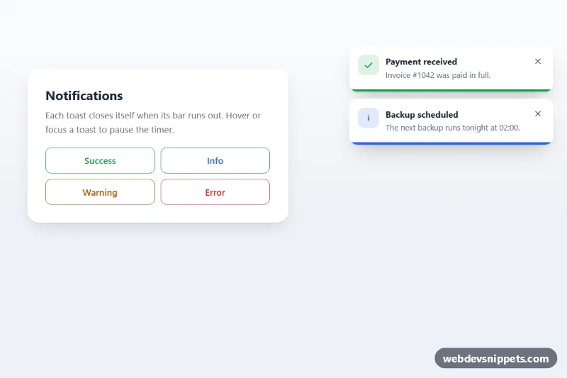
Toast with Progress Bar
Stacked toast notifications with a CSS countdown progress bar that pauses on hover or focus and closes the toast when it runs out.
Temporary notification popups.
3 component(s)
Stacked toast notifications with a CSS countdown progress bar that pauses on hover or focus and closes the toast when it runs out.
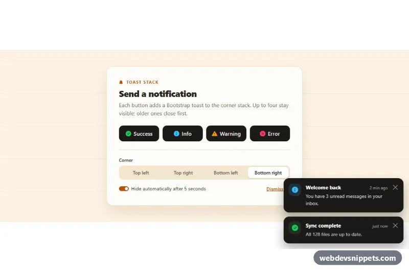
Bootstrap 5 toast notifications in a corner stack: success, info, warning and error buttons, selectable corner, auto-hide with a progress bar and a stack limit.
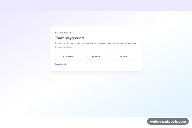
Stacking Tailwind CSS toast notifications for success, error and info with auto-dismiss countdown, pause on hover and accessible live region.
A toast is a small, temporary notification that slides into a corner of the screen, shows a short message and then disappears on its own. Toasts confirm that something happened in the background without interrupting the user: "Message sent", "Settings saved", "Item added to cart" or "Connection lost". They are common in web apps, dashboards and e-commerce sites.
Place toasts in a live region so screen readers announce them: role="status" with aria-live="polite" for normal messages, and role="alert" only for urgent ones. Give users enough time to read; around five seconds is a reasonable minimum, and toasts with an action should pause their timer on hover and focus or stay until dismissed. Include a close button with an accessible label. Do not move keyboard focus into a toast, as that interrupts what the user is doing.
These bootstrap toast examples and toast notification HTML CSS snippets come in Bootstrap 6, Bootstrap 5, Tailwind CSS and pure CSS. Bootstrap 5 versions use the toast component and its JavaScript API; Bootstrap 6 versions use the new ES module build and theme-* colour roles for success, warning and danger variants. Tailwind and pure CSS versions include a lightweight script to show and hide them. Trigger them in the live preview, copy the code from the code tabs, or download it.