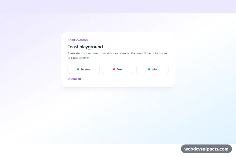
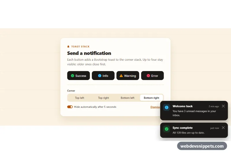
A stacking toast notification system built with Tailwind CSS and vanilla JavaScript, with dark success, error and info toasts that slide in from the corner, show a countdown bar and close themselves. Use it for save confirmations, failed uploads, new messages and other short, non-blocking feedback.
How it works
The root is .ttn-toaster. It holds the demo buttons, one <template data-ttn-template="…"> per toast type and the empty .ttn-region container, which is fixed to the bottom of the screen (full width on phones, bottom-right from sm up). Buttons with data-ttn-show clone the matching template, optionally replace the text of data-ttn-title and data-ttn-message with the button's own attributes, and append the toast to the region. When more than data-ttn-max toasts are open, the oldest ones are dismissed.
Auto-dismiss is driven by CSS instead of setTimeout: the .ttn-progress bar runs the ttn-countdown keyframes for --ttn-duration, and its animationend event closes the toast. Because .ttn-toast:hover and .ttn-toast:focus-within set animation-play-state: paused, hovering or tabbing into a toast pauses its timer exactly where it is. Closing adds .ttn-leaving, which plays ttn-out before the element is removed. The close button, Escape inside a toast and the data-ttn-clear button all dismiss toasts.
Other code can raise a toast without globals by dispatching a ttn:show CustomEvent on the root with detail: { type, title, message, duration }.
Customization
data-ttn-durationon.ttn-toaster: default lifetime in milliseconds (5000); the error template overrides it with its owndata-ttn-duration="8000".data-ttn-maxon.ttn-toaster: how many toasts can stack before the oldest is removed.data-ttn-welcome="info"on the root shows a toast on page load for the demo; delete the attribute in production.data-ttn-titleanddata-ttn-messageon adata-ttn-showbutton: per-trigger text, as on the Info button.bottom-0on.ttn-region: usetop-0for a top stack; replacesm:left-auto sm:items-endwithsm:right-auto sm:items-startto move it to the left corner.bg-slate-900andsm:w-96on.ttn-toastin each template: switch tobg-white text-slate-900for light toasts or widen them.- Add a new type (for example
warning) by copying a template, renamingdata-ttn-templateand swapping theemeraldcolors.
Accessibility
.ttn-region is a labelled role="region" with aria-live="polite", so success and info toasts (role="status") are read without interrupting, while the error template uses role="alert" to be announced immediately. Each close button has a visually hidden "Dismiss notification" label and a visible focus outline. Timers pause on keyboard focus, giving users time to read, and when a focused toast closes, focus moves to the next toast or back to the button that opened it. Under prefers-reduced-motion the slide animations are removed and the moving bar is hidden while the timer still runs.
Usage notes
Keep toast messages short and never put the only copy of important information in one. Each .ttn-toaster works independently.