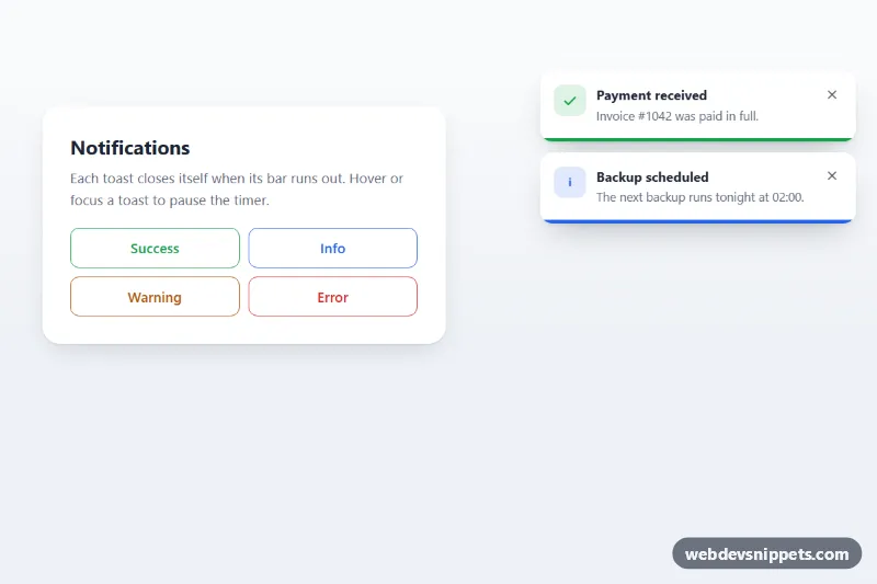
A toast notification stack in pure CSS and vanilla JavaScript where each toast shows a shrinking progress bar and closes itself when the bar runs out. Use it for save confirmations, upload errors, background job updates and other short status messages.
How it works
The demo section .tp-demo contains a .tp-controls card with four .tp-trigger buttons and a fixed .tp-region holding the list ol.tp-stack. Every toast is an li.tp-toast with a type modifier (.tp-toast--success, --info, --warning, --error), an icon, a .tp-toast__body with title and message, a .tp-toast__close button and a .tp-toast__bar.
The countdown is pure CSS: .tp-toast__bar runs the tp-countdown keyframes, which scale it from full width to zero over var(--tp-duration). Hovering a toast or moving focus into it sets animation-play-state: paused, so the timer stops while the user reads or reaches for the close button.
The script reads data-tp-duration from each toast and writes it to --tp-duration. It listens for animationend: when tp-countdown ends, the toast gets .tp-toast--leaving and plays tp-out; when that ends, the element is removed. A click on a .tp-trigger builds a new toast from its data-tp-type, data-tp-title, data-tp-message and optional data-tp-duration, and adds it to the top of the stack. Only four toasts stay visible (MAX_TOASTS in script.js); older ones are dismissed. The two toasts in the markup show the finished look on page load.
Customization
data-tp-durationon a.tp-triggeror.tp-toast: display time in milliseconds;DEFAULT_DURATIONinscript.jsis used when it is missing.--tp-success,--tp-info,--tp-warningand--tp-erroron.tp-demo: the icon, tint and progress bar color for each type.--tp-width: toast width on screens from 640px; below that the stack spans the bottom of the screen.topandrighton.tp-regionin themin-width: 640pxmedia query: move the stack to another corner.MAX_TOASTSinscript.js: how many toasts can be visible at once.--tp-radius: corner radius of each toast.
Accessibility
The stack sits in a labelled role="region" and the list is an aria-live="polite" area with aria-relevant="additions", so new messages are announced without interrupting the user. Icons and the bar are aria-hidden. Each close button has aria-label="Dismiss notification" and a visible focus ring, and Escape closes the toast that has focus. Pausing on focus gives keyboard users enough time. With prefers-reduced-motion: reduce the slide in and out animations are shortened to an instant change, while the progress bar keeps counting.
Usage notes
To show a toast from your own code, create the same li.tp-toast markup or reuse buildToast() inside the script, for example after a fetch() call finishes. Keep error messages longer than success messages.