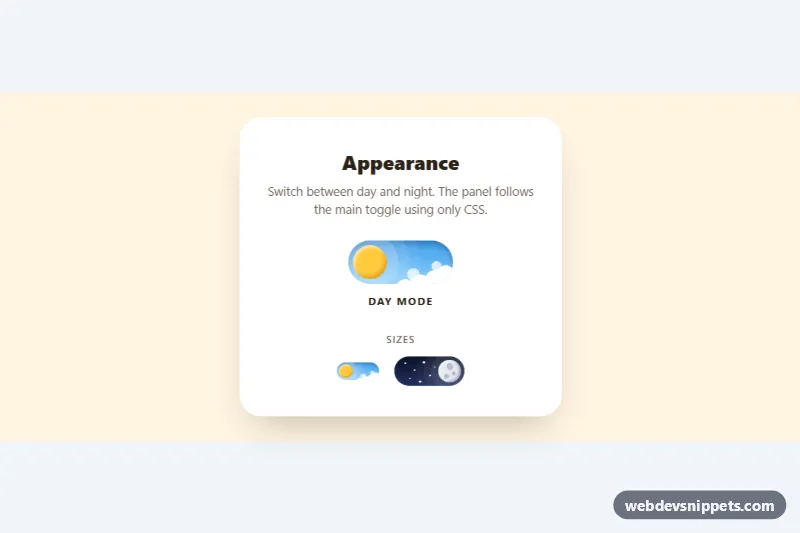
An animated day and night toggle switch built with pure CSS. In day mode a glowing sun sits in a blue sky above fluffy clouds; when switched on, the sun rolls across the track and turns into a cratered moon, the clouds sink away and stars fade in on a navy sky. Use it as a dark mode switch in headers, settings panels or portfolio sites.
How it works
The root section.dn-scene holds a .dn-card with the main switch and a row of smaller examples. Every switch is a label.dn-toggle wrapping a visually hidden input.dn-input (a checkbox with role="switch") and a decorative span.dn-track. The track contains .dn-stars, .dn-clouds and the .dn-orb with three .dn-crater spans.
The track paints the day sky from --dn-sky-day, and its ::before layer holds --dn-sky-night with opacity: 0. Clouds and stars are single elements multiplied with box-shadow copies, and the halo rings around the sun are extra spread shadows on .dn-orb. When the input is checked, the .dn-input:checked + .dn-track selectors fade in the night sky, move the orb with translateX(5.25em), recolor it to --dn-moon, show the craters, push the clouds down and drop the stars into place. Every dimension uses em, so the font size on .dn-toggle scales the whole switch. Finally, .dn-scene:has(.dn-toggle--main .dn-input:checked) swaps the page and card colors, so the main toggle themes the panel without JavaScript.
Customization
--dn-sizeon.dn-toggle: the base font size that scales every part of the switch;.dn-toggle--smand.dn-toggle--lgset 6px and 15px.--dn-sky-dayand--dn-sky-nighton.dn-scene: the two sky gradients of the track.--dn-sun,--dn-moonand--dn-crater-color: the orb colors in each state and the crater color.--dn-speed: the duration of every transition, including the theme change of the card.--dn-focus: the outline color shown around the track on keyboard focus.- Add
checkedto an.dn-inputto start in night mode, as on the default-size example. - Move the
.dn-toggle--mainclass to another toggle to make it control the panel theme.
Accessibility
Each switch is a native checkbox with role="switch" and an aria-label such as "Dark mode", so it is announced as a switch with its on or off state and toggles with Space. The track is aria-hidden, as is the "Day mode / Night mode" caption, since the state is already announced. Keyboard focus draws an outline around the track with --dn-focus. Under prefers-reduced-motion: reduce all transitions become near-instant.
Usage notes
To theme a real site, read the checkbox in a few lines of JavaScript and set a class or data-theme on html. The :has() theming needs a current browser; the switch animation works without it.