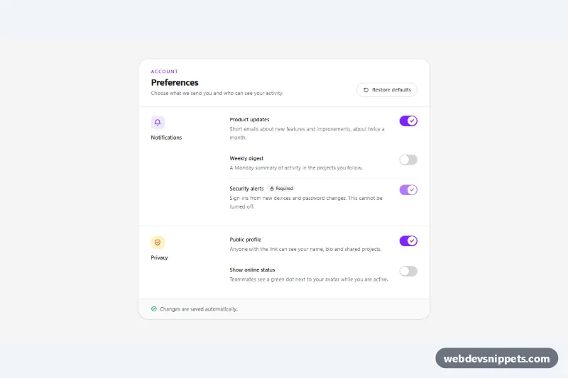
Settings Toggles with Description
Tailwind CSS settings panel with accessible switches, label descriptions, a locked required option, restore defaults and an auto-save status message.
On/off switches and toggle buttons.
3 component(s)
Tailwind CSS settings panel with accessible switches, label descriptions, a locked required option, restore defaults and an auto-save status message.
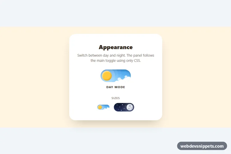
Animated pure CSS day and night toggle switch where the sun turns into a cratered moon, clouds drift away and stars appear.
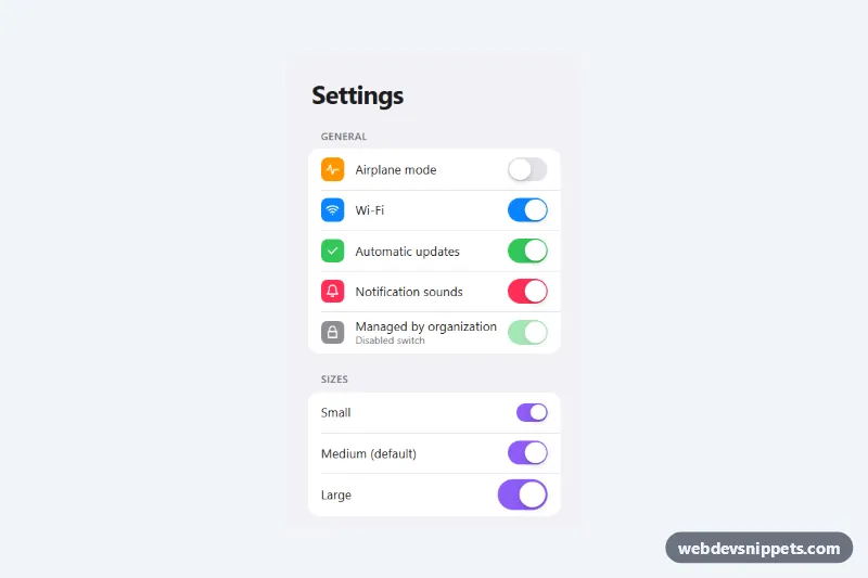
Pure CSS iOS style toggle switches built on real checkboxes, in a grouped settings list with three sizes, five colors and a disabled state.
A toggle switch is an on/off control that looks like a physical switch. It is used for settings that take effect immediately, such as enabling notifications, dark mode, or a feature flag. This category also covers toggle buttons and segmented on/off controls, for example a monthly and yearly billing toggle on a pricing page.
<input type="checkbox"> with role="switch", or a <button> with role="switch" and aria-checked.:focus-visible style; custom switches often lose the default outline.transform for smooth performance, and reduce or remove motion under prefers-reduced-motion.The toggle switch examples here include simple switches, switches with icons and labels, large mobile-friendly switches and pricing toggles. Bootstrap 6 versions use theme-* colour roles for the active track. Bootstrap 5 versions use .form-switch with .form-check-input, Tailwind CSS versions use peer and peer-checked: variants, and the pure CSS toggle switch versions need no JavaScript. Use the live preview to compare them, then copy or download the HTML and CSS and rename the labels for your settings.